Painting Demo: Acrylic Still Life with Pomegranates and Topo Chico
Oct 22, 2025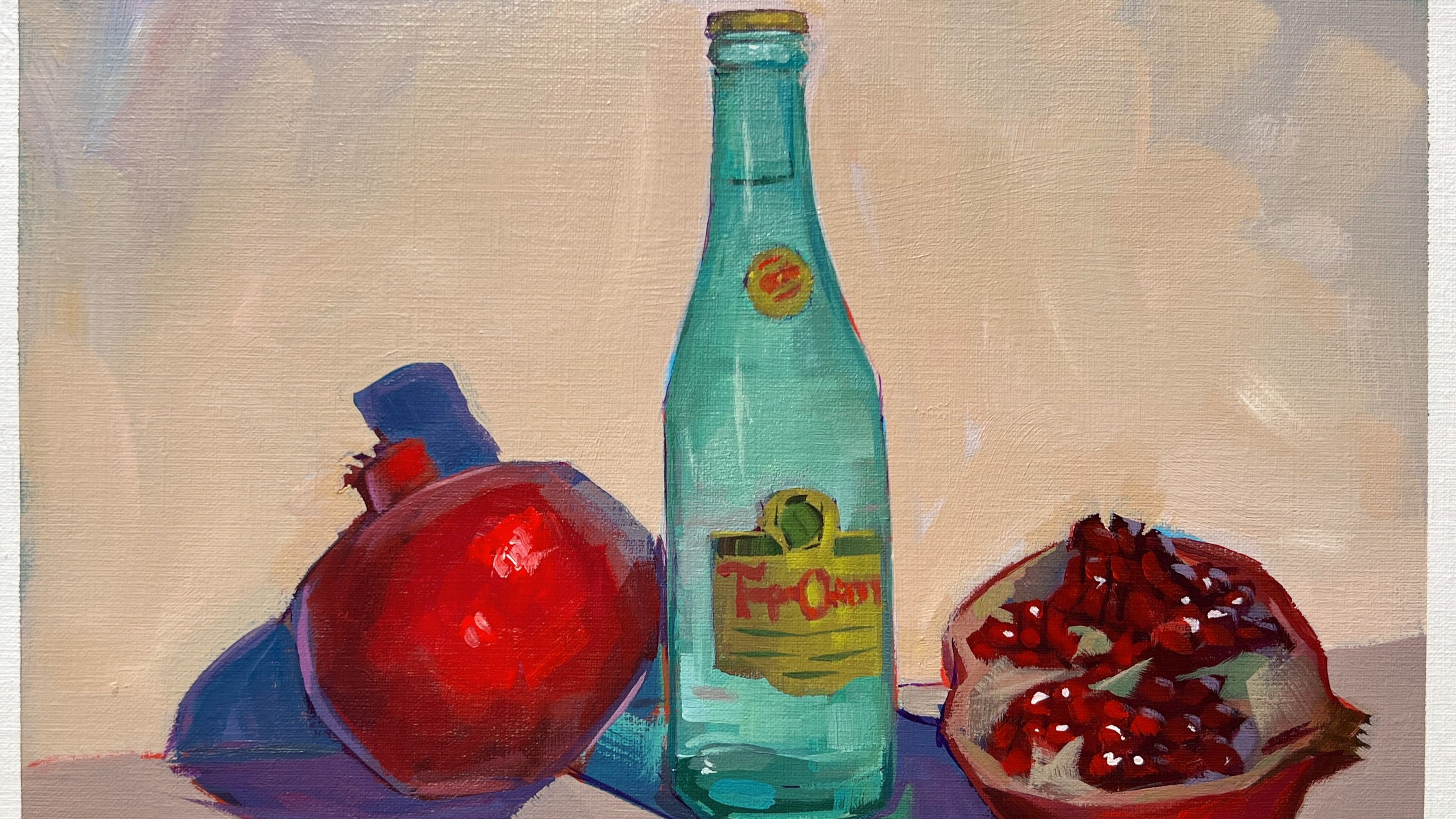
Today (October 22, 2025) I joined Art School Live on YouTube — you can watch the full demo here. It was such a joy to chat, paint, and share some of my favorite acrylic painting tips!
One topic that came up was just how unique acrylics are compared to other mediums. Acrylics can be tricky for artists coming from oil, but they’re also incredibly forgiving. Unlike oils, you don’t have to worry about the fat over lean rule — acrylics are borderline indestructible (for better or worse).
In this post, I’m including:
- My full materials list and palette
- Color and value studies
- Links to more still-life resources and courses
Reference Photo
Please feel free to utilize my reference photo for painting studies. I only ask that if you paint this image and share it online, please credit me for the reference image.

Materials and Palette
I used a Sta-Wet palette and the following colors:
- Titanium White
- Cadmium Yellow Light
- Yellow Ochre
- Cadmium Red Medium
- Quinacridone Magenta
- Ultramarine Blue
- Phthalo Blue (Green Shade)
- Sap Green
Below is my color wheel using these pigments.
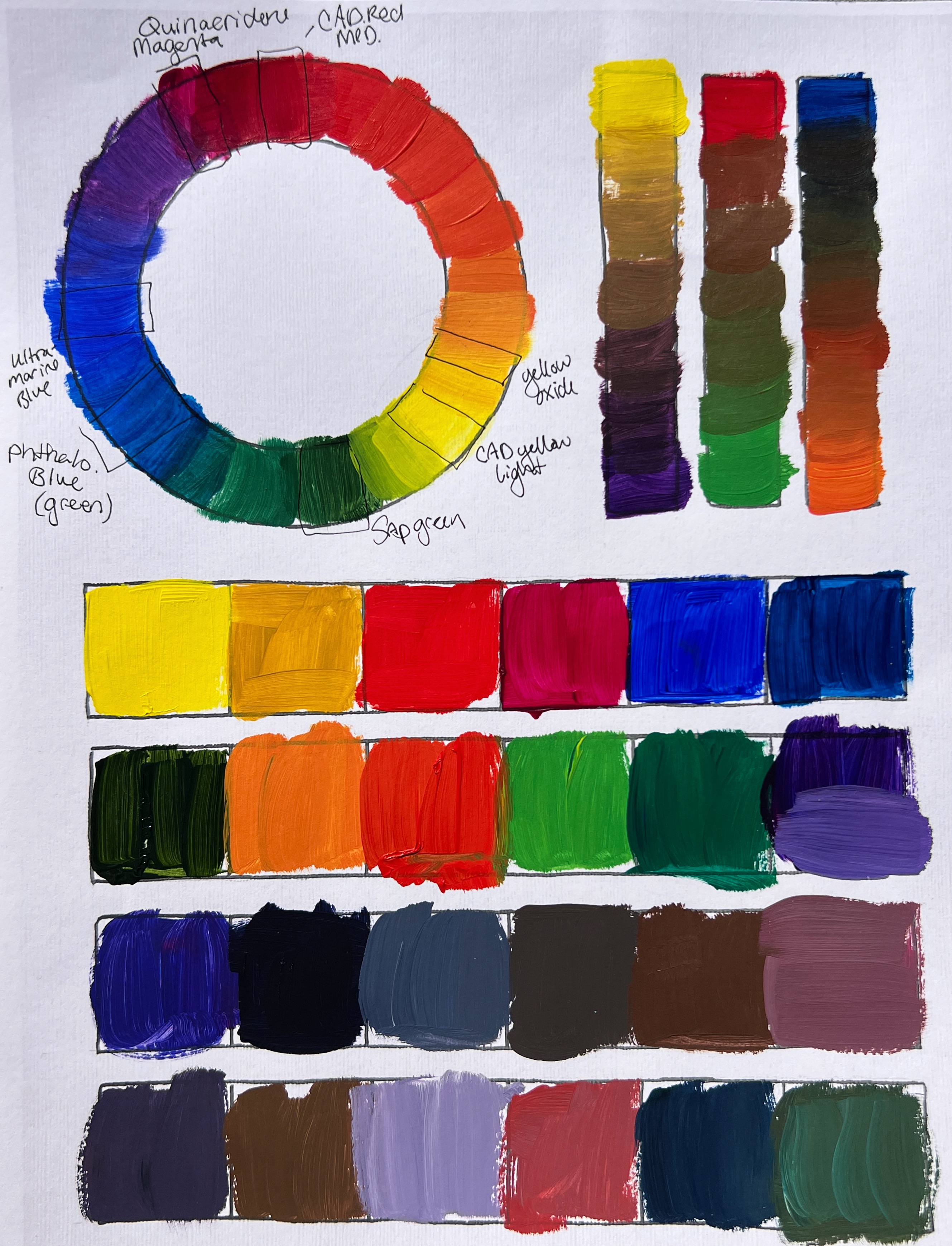
As painters, our job is to interpret the world — whether we’re painting from life or from photos — and that means translating additive color (light) into subtractive color (pigment). Because of this, I like to start by finding my most spectral options in color-wheel form before painting.
Notice the three columns on the right where I found my primaries, matched their secondaries, and blended neutrals. In theory, perfect complements create a chromatic gray in the center — but in practice, pigments vary, and you’ll often end up with beautiful muted browns and grays instead.
Value Studies: Your Mom Was Right (Drink Water, Do Value Studies)
I know — every teacher says to start with value studies. And much like your mom reminding you to drink water, it’s annoying but true. Value studies are the quickest remedy for most drawing and painting problems.
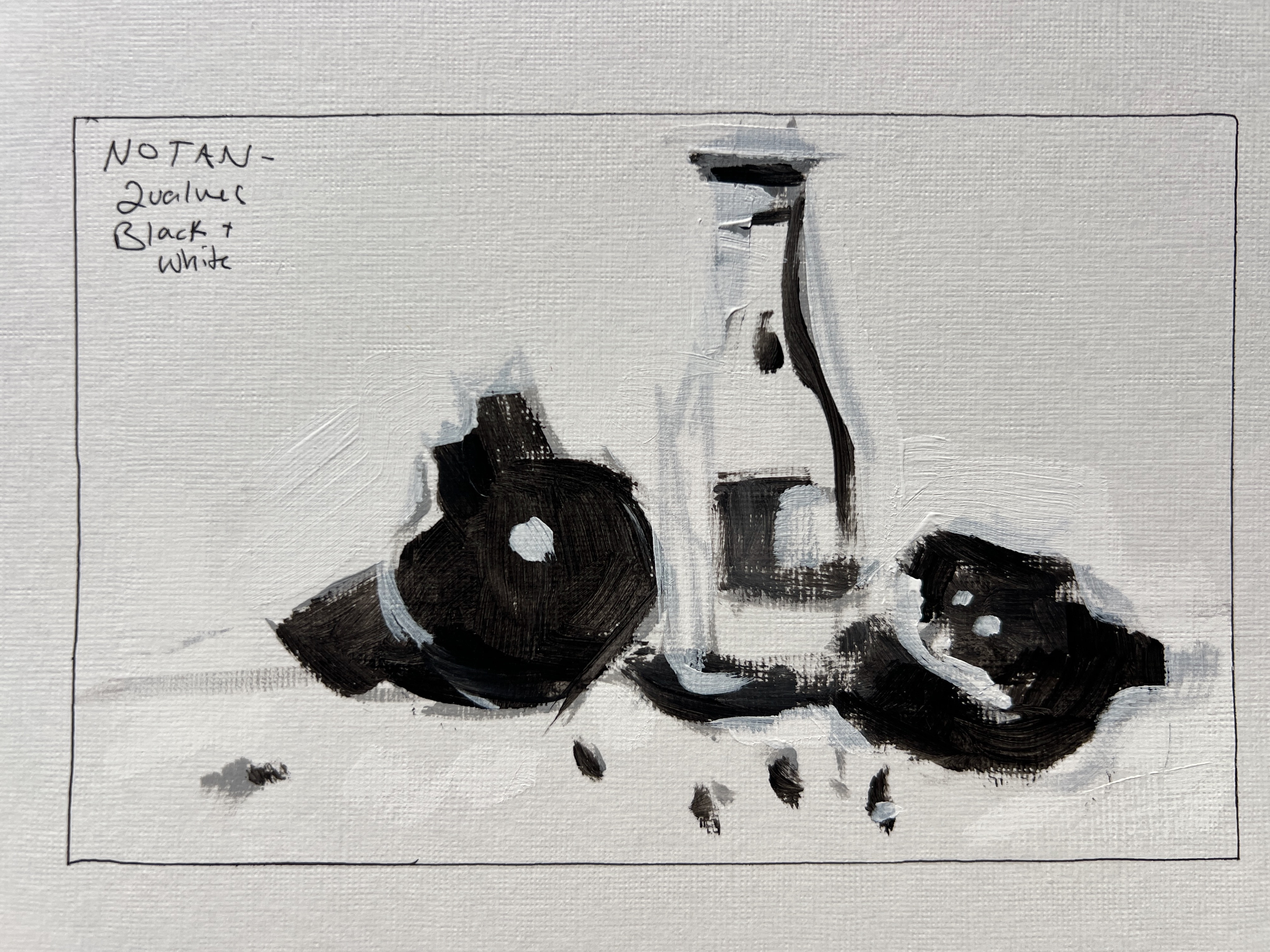
Notan Study (2-Value)
I always start with a Notan, using only black and white to divide the scene into light and dark. Don’t expect these to look “good” — the point is to see structure. In this still life, for example, the pomegranate is dark even in light, which tells me how it will behave tonally.
3-Value Study
After the Notan, I add a middle gray. I often start by toning my surface with that gray, then push lighter and darker to find form and balance.

5-Value Study
This is where most paintings live — just five values: black, white, 25%, 50%, and 75% gray. The goal isn’t perfection but order. If your values are in the correct hierarchy, the color will almost always fall into place.
When paintings feel “off” or cartoonish in a way you didn’t intend, it’s often a value-order issue. Get this right first.

Color Studies
Color is contextual — its meaning changes depending on what’s next to it. These two quick color studies help you understand that in real time.
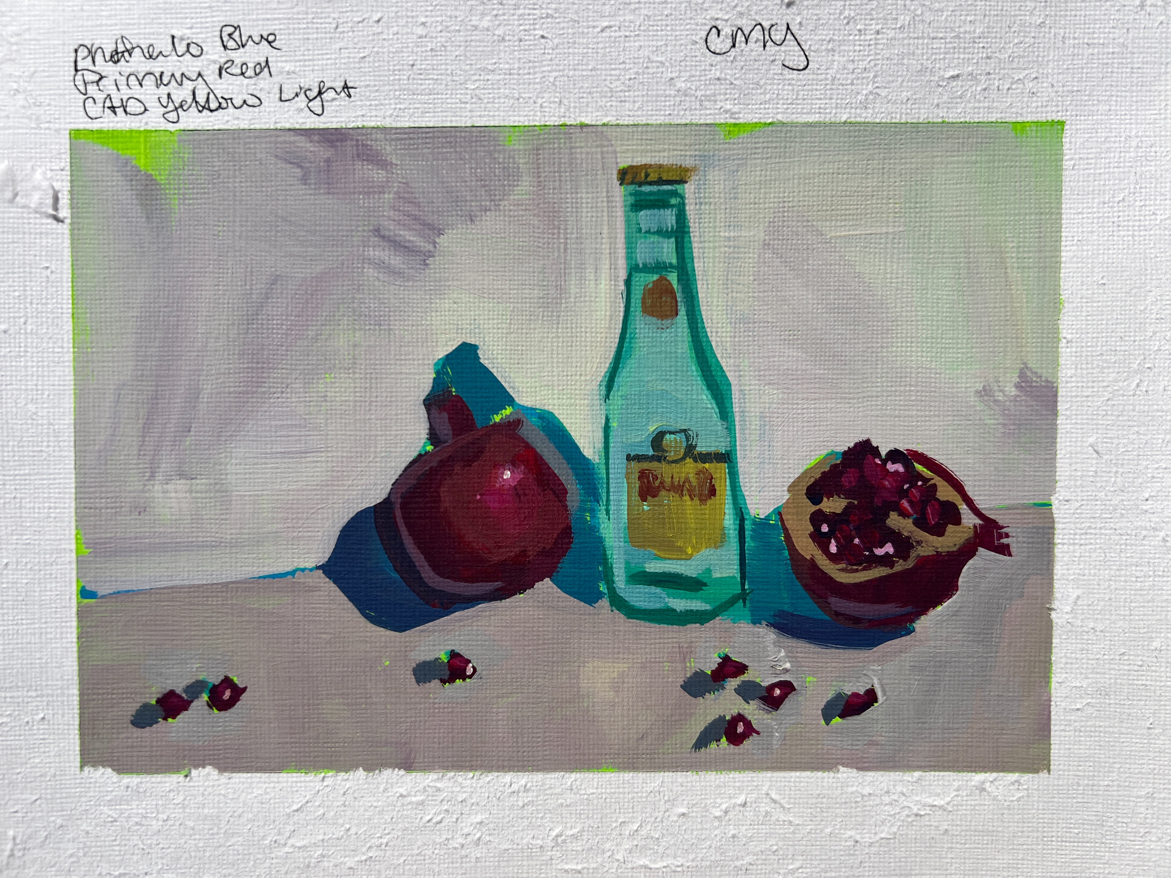
CMY (Cyan, Magenta, Yellow) Palette
Using Quinacridone Magenta, Phthalo Blue (Green Shade), and Cad Yellow Light, this palette mimics the logic of a printer’s ink set. I always joke that I have printer envy — my inkjet can reach incredible color ranges with just CMY, and so can we as painters.
Secondary Palette (Orange, Green, Violet)
For extra challenge, I sometimes use only secondaries: Dioxazine Purple, Cad Orange, and Vivid Lime Green. It’s like painting on hard mode. Focus less on drawing accuracy here and more on color relationships and harmony.
If this feels tough, try researching other limited palettes and use them as short warm-ups in your studio practice.

Final Painting
Here’s the finished piece from today’s demo — a Topo Chico bottle and pomegranates, painted in acrylic.

Final Thoughts: Treat Painting Like an Athletic Practice
Something I mentioned during the demo is that I come to painting from a running background. I believe painting should be rigorous, not too serious.
Just like an athlete:
- Push through the discomfort
- Focus on form and fundamentals
- Show up consistently
The discomfort of “not quite getting it” is part of the process. You’ll improve by showing up, not by waiting for inspiration.
More Resources
- My Book: Modern Still Life: From Fruit Bowls to Disco Balls
- Free 7-Day Painting Boot Camp
- Lifetime Access Membership to Not Sorry Art School — includes 16+ courses and monthly live classes
❤️ Sari
WANT MORE PAINTING EXPERTISE?
Sign up for the Not Sorry Art School newsletter for exclusive offers, course updates, free perks and more!


