"How to See Color & Paint It": Materials, Intentions, and How We’ll Work Together
Jan 19, 2026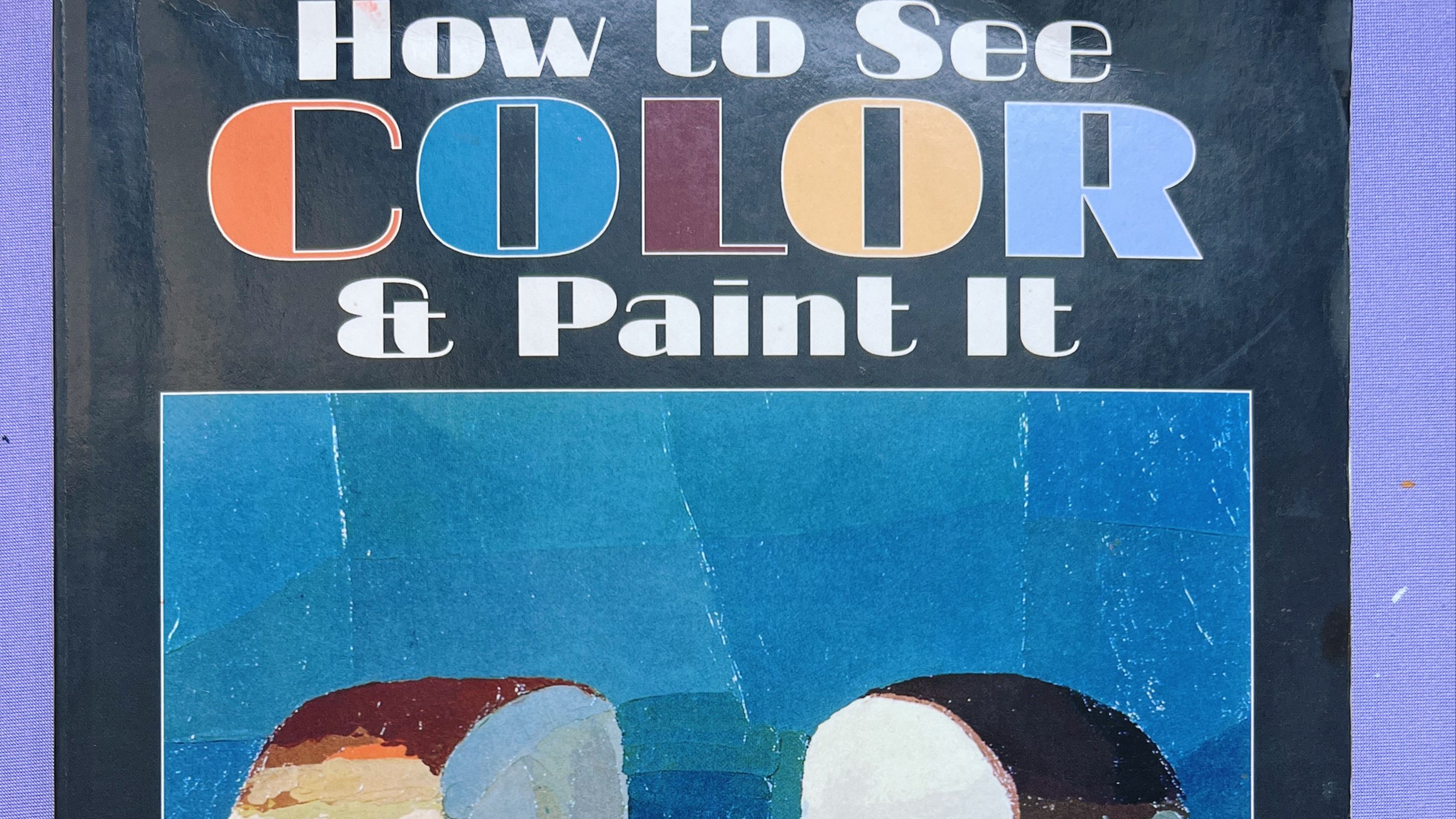
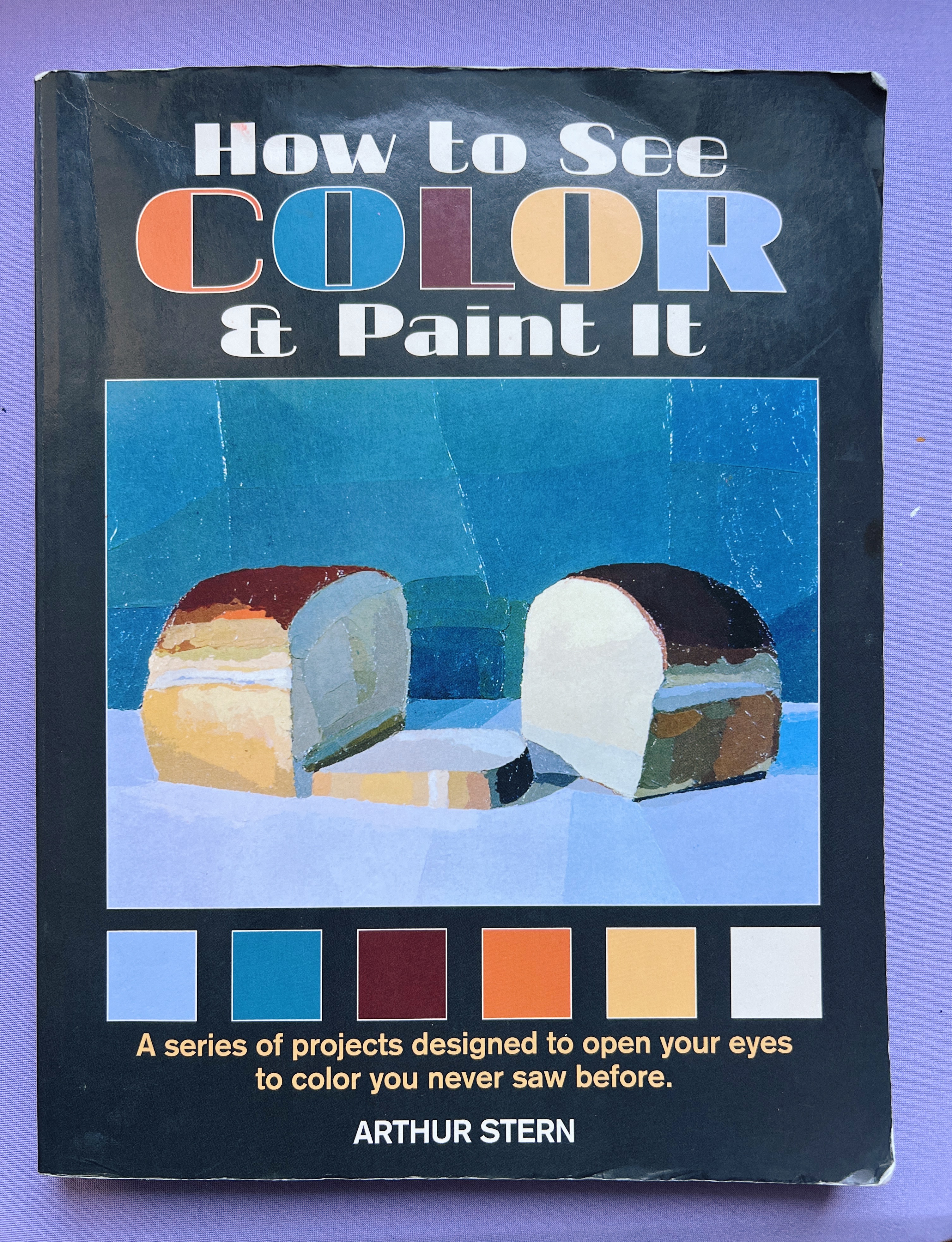
This year, we’re tackling a long-beloved painter’s staple: How to See Color and Paint It by Arthur Stern.
I can’t exactly remember the first time this book was suggested to me—I suspect it was mentioned by a painting professor in college—but my interest was fully piqued years later when a painter I followed on Instagram dedicated a large portion of a year to slowly working through it. I immediately tracked down a copy.
[YouTube video: This Book Is Basically Two Semesters of Painting]
Admittedly, this book drifts in and out of print, which always makes me a little hesitant to recommend it outright. That said, many of you who’ve been around Not Sorry Art School for years have told me you’ve found copies at thrift stores, used bookstores, or online. It’s good enough—and foundational enough—that I trust it will persist. (And honestly, if you love it, write the publisher and ask for another run.)
More importantly, I wanted to work through this book together, so that even if you can’t find a copy, you can still participate meaningfully as a member of Not Sorry Art School.
Here is the recording of the first live demo of this "How To See Color & Paint It" bi-weekly series
This series is an interpretation and adaptation inspired by Arthur Stern’s book. It is not a reproduction of the book’s text or exercises, and I strongly encourage purchasing the book if you are able. Stern’s instructions and examples, presented in his own words, are invaluable.
The book was written with oil paint in mind. I’ll be adapting the exercises primarily for acrylic, though you’re welcome to follow along using any opaque, layerable medium (acrylic gouache and traditional gouache will also work well).
At periodic points, I’ll publish blog posts like this one to serve as a written reference for what we cover in our bi-weekly live sessions (ideally ~90 minutes each), where I’ll work through each assignment in real time. The first few sessions will focus on materials, how to use the book, and how Stern thinks about color. From there, we’ll move into the 22 exercises, which increase gradually in complexity.
Stern recommends setting up a simple shadow box—three black panels and a direct light source—and painting everyday objects: toilet paper rolls, fruit, glassware, fabric, and eventually more complex still lifes. The real focus, though, isn’t the objects themselves. It’s training the eye. This is why the book is so beloved.
At its core, How to See Color and Paint It is not about rendering or style. It’s about learning to see clearly before you paint. That principle is central to my own teaching as well. Brushwork, finish, and even “good taste” don’t matter much if we haven’t first done the harder work of unlearning our assumptions about what we think the world looks like.
To underscore that point (and to dispel any overly saccharine expectations), every exercise in the book is done entirely with palette knives. The idea is simple and radical: if you can place colors accurately—in relationship to one another—even with a blunt, imperfect tool, you can paint convincingly. The student examples in the book are genuinely beautiful and deeply encouraging.
I’m excited to return to this kind of foundational work myself. I’ve reached a point in my career where I’m convinced you can never be too advanced—or too humble—for the basics.
Why Acrylics (and Not Oils)?
In my personal practice, I paint roughly 50/50 between acrylic-based media and oils, with the occasional foray into traditional gouache. Over time, I’ve come to favor oils for their versatility. But when I put on my teacher hat, acrylic paint is hard to beat.
Assuming you’re disposing of paint water responsibly—using evaporation methods, paint hardener, or cat litter rather than pouring it into the water system—acrylics are safer, more accessible, and far more forgiving in a live teaching environment.
More importantly, acrylics force deliberate color mixing.
It’s one thing to make something hard for the sake of difficulty. Constantly rearranging your palette, for example, offers no real benefit. You wouldn’t rearrange your laptop keyboard every day—why do it with your paints?
But there’s another kind of “hard” that does matter. Mixing full gradients—intentionally creating the steps between dark and light rather than blending them together—strengthens your ability to see value and color relationships, which is one of the most important skills a painter can develop.
Ironically, students who start in acrylic and later transition to oil often have a much smoother experience. They’ve already built strong seeing and mixing muscles and can relax into oils more confidently.
On a practical note: I’ll be working from my home studio, which doesn’t have ideal ventilation. Acrylics also allow me to demonstrate mistakes, wait thirty seconds, and correct them live—without the preciousness oil sometimes demands.
Colors (What the Book Calls For, and What I’m Using)
Stern’s palette includes:
Alizarin crimson
- Cadmium red light
- Cadmium orange
- Cadmium yellow pale
- Phthalo green
- Phthalo blue
- Ultramarine blue
- Titanium white
The book doesn’t specify brands or pigment variations, and pigment formulations have evolved significantly since the 1980s. Some colors—particularly phthalos—now come in multiple shades. With that in mind, here’s what I’ll be using and why:
- Alizarin Crimson (Golden) – Deeper and stronger in value than many alternatives. One of the few colors I consistently prefer from Golden over Liquitex.
- Cadmium Red Light – A warm, intense red (think tomato soup).
- Cadmium Orange – Straightforward and essential.
- Cadmium Yellow (Light / Lemon / Primrose) – Look for a cool, opaque yellow. Avoid cad yellow medium and overly transparent yellows. This is a pigment worth buying at higher quality.
- Phthalo Green (Yellow Shade) – Chosen for greater chromatic range.
- Phthalo Blue (Green Shade) – A strong, true phthalo blue that pairs well with the green.
- Ultramarine Blue – Standard ultramarine (red shade if specified).
- Titanium White – Not mixing white. If buying small tubes, double up—white goes fast.
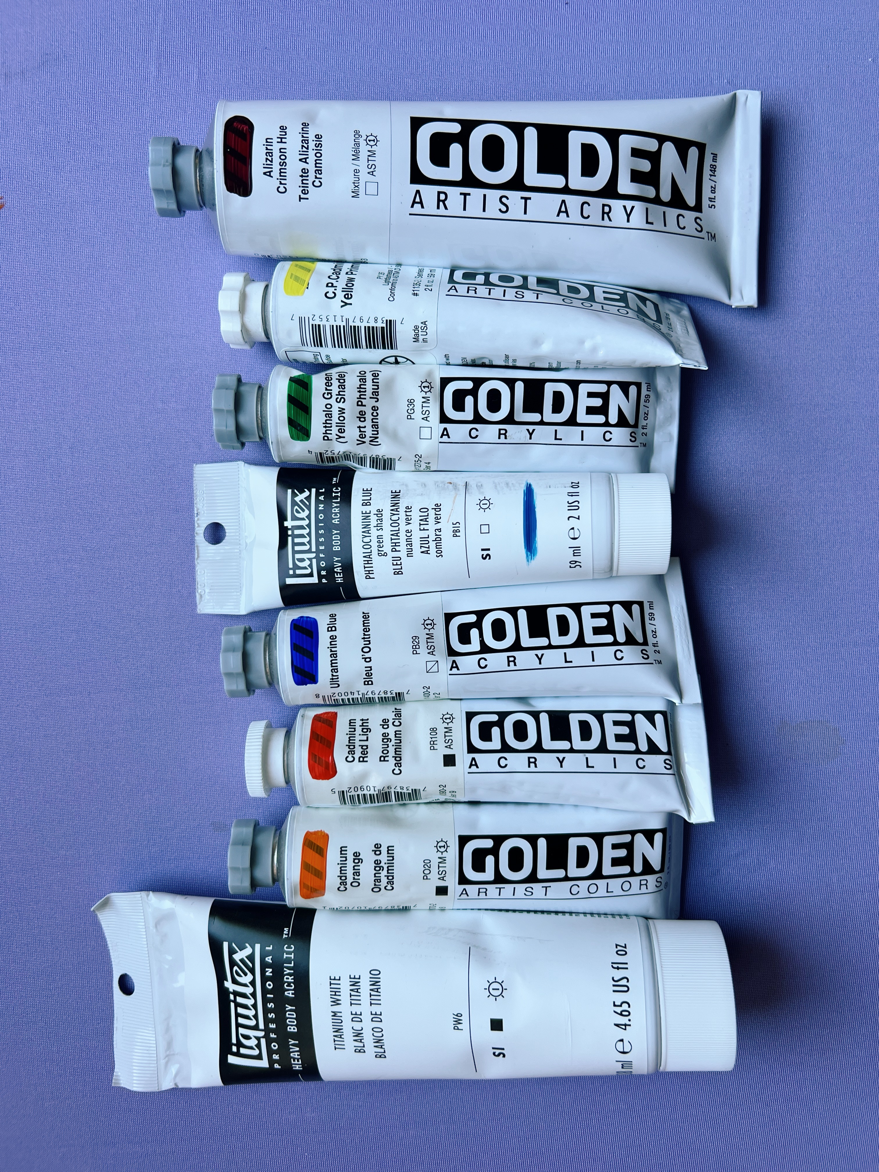
High-quality yellow and white are worth the investment. Everything else can be student grade if needed. I’ll have Liquitex Flow Aid mixed at the recommended ratio on hand, though it’s optional. Palette knife painting works across a wide range of paint viscosities.
Surfaces, Tools, and Setup
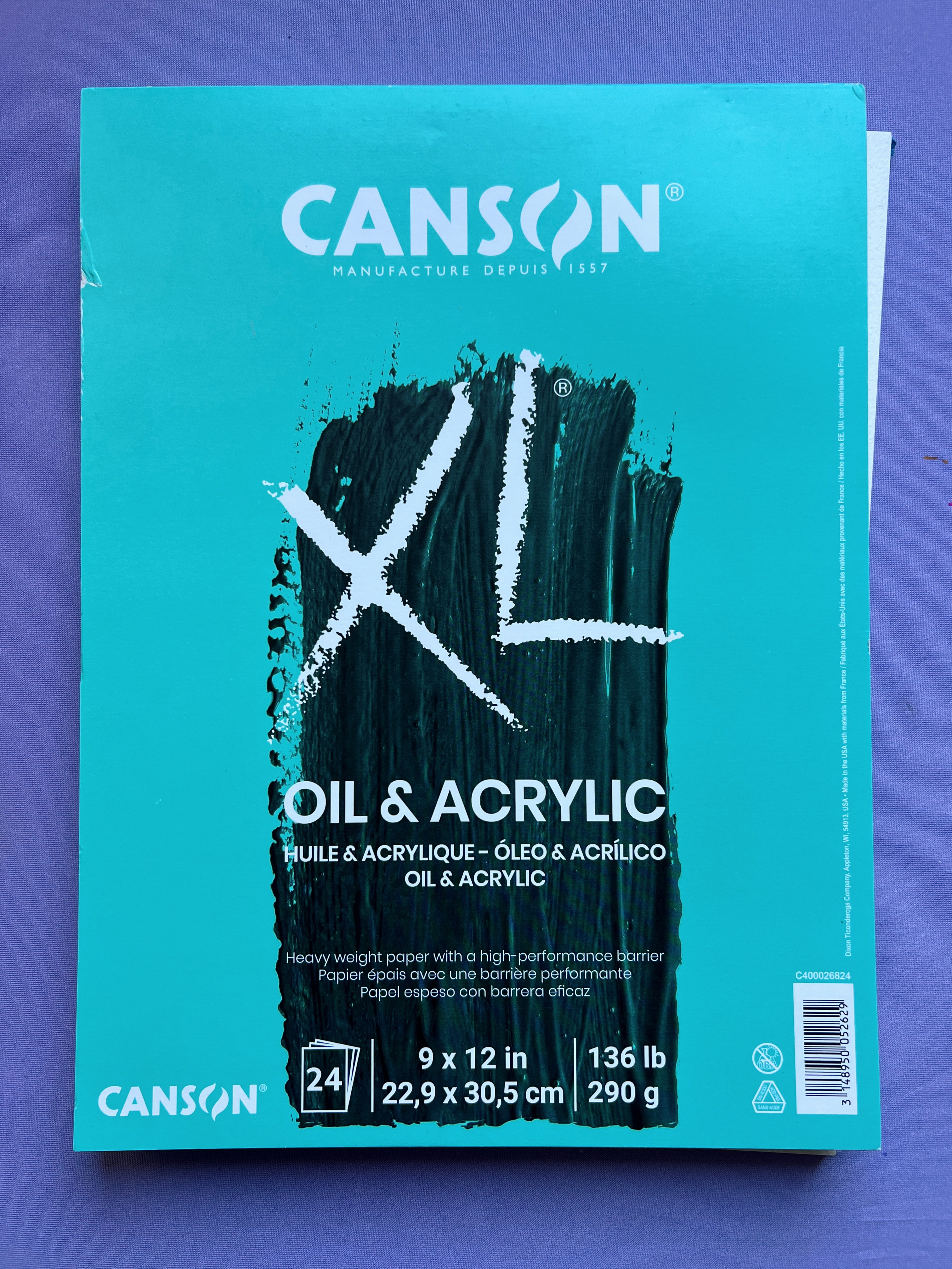
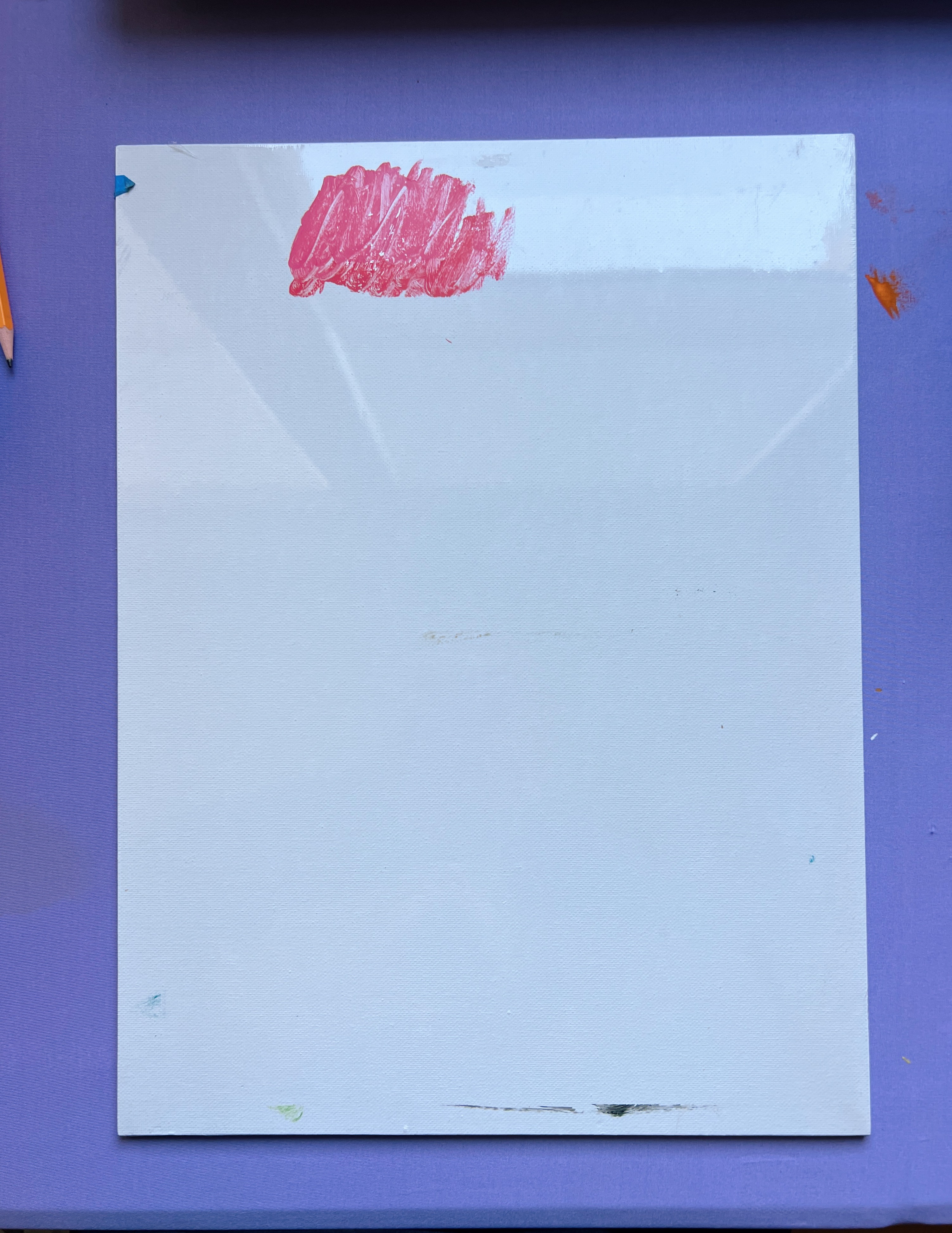
- Paper: Any acid-free oil or acrylic paper with a bit of tooth. Windsor & Newton and Canson both make excellent pads. I’ll be using Canson Oil & Acrylic Paper, 9×12. (Canson Oil & Acrylic Paper)
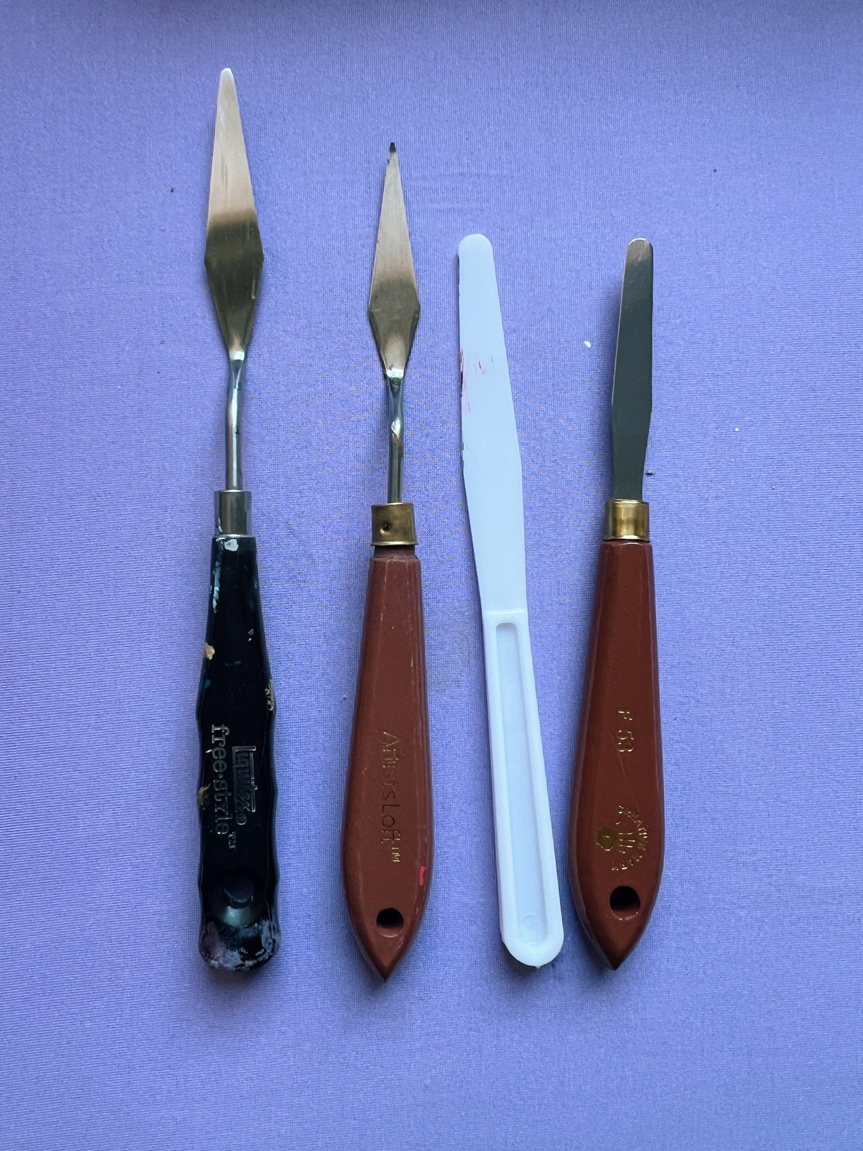
- Palette Knives: You only need two—a flat, straight knife and a slimmer one. Size should be proportional to your paper. As a rule, your marks should feel slightly larger than comfortable. (Liquitex Professional Freestyle Painting Knife)
- Palette: Gray disposable palette paper or a gray glass palette. I’m using 12×16 gray palette paper and a Masterson Stay-Wet Palette (highly recommended for acrylics). (SoHo Urban Artist Palette)
- Gray Gesso: I’ll be priming every surface with Liquitex Neutral Gray (N5) gesso. This aligns with the book’s goal of controlling variables so you can focus on seeing color. (Liquitex Gray Gesso)
- Acrylic Fluid Medium
- View Catcher
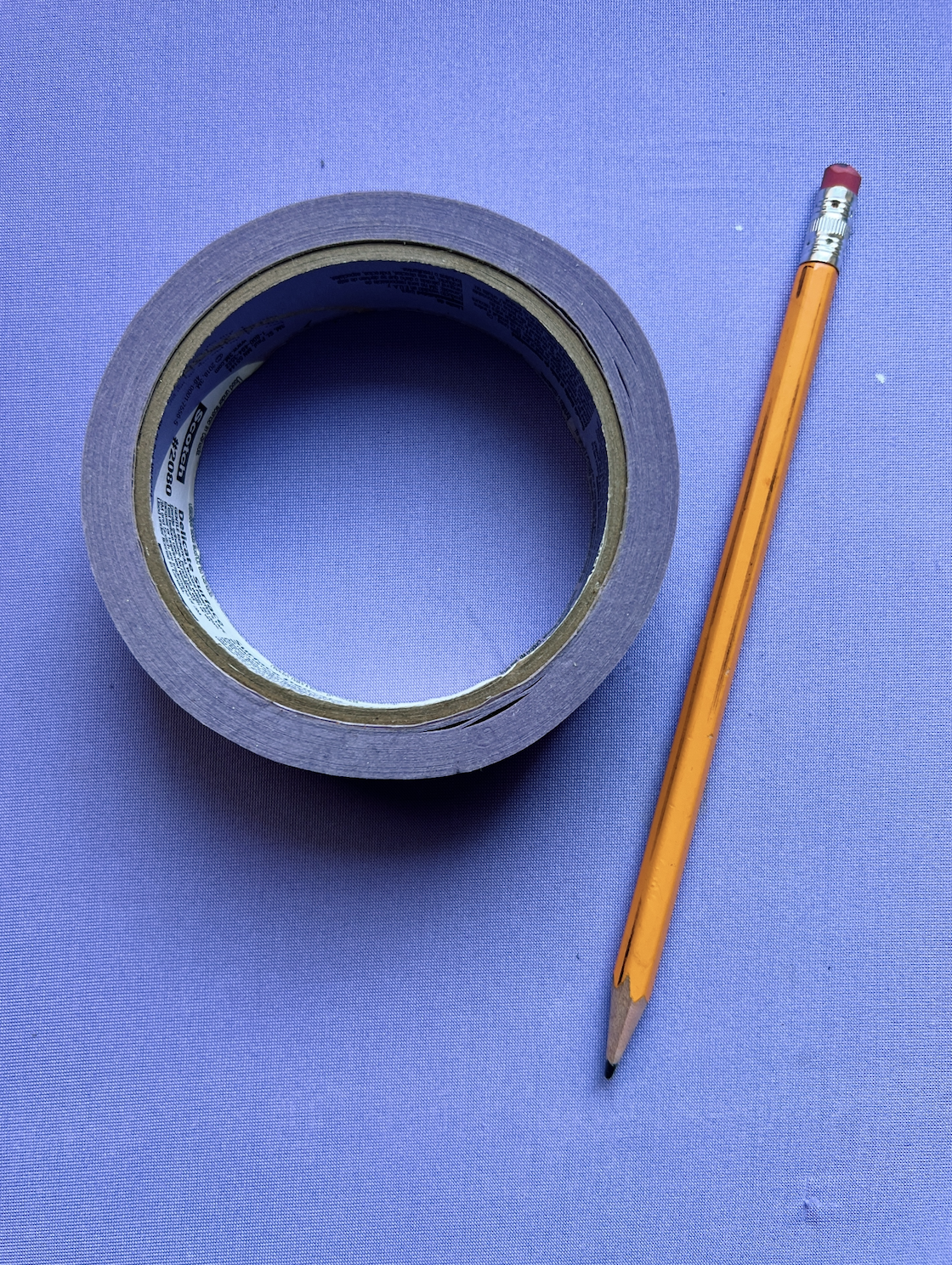
- Drawing & Measuring Tools: Pencil, tape, index cards or gray-painted cards for spot checking, or a commercial viewfinder with a center dot. (Scotch delicate surface painter's tape)
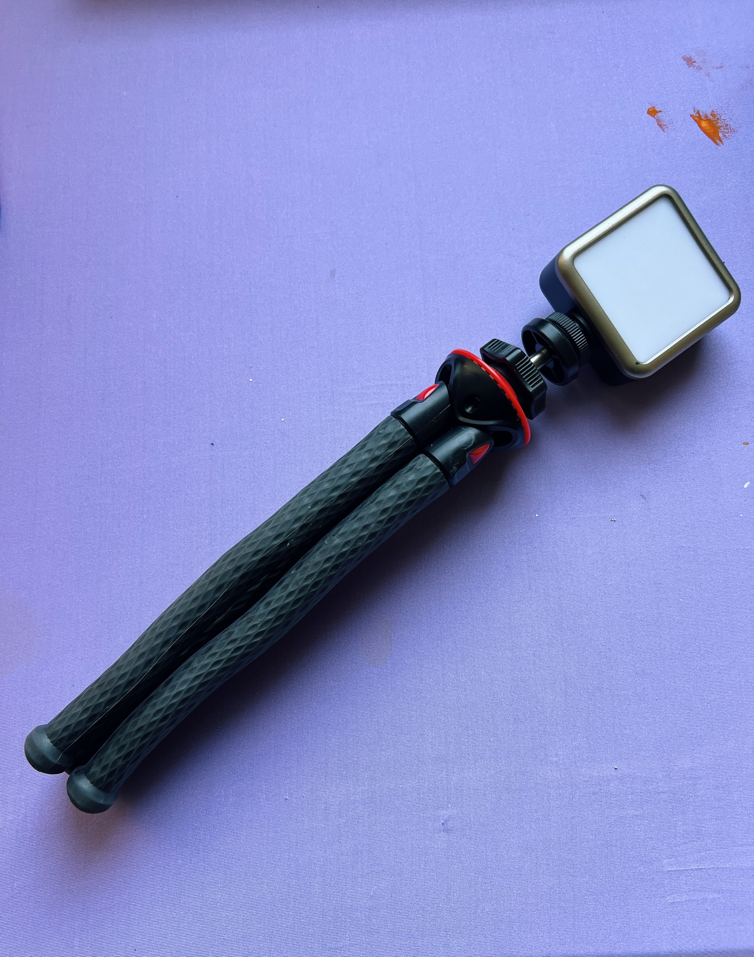
- Lighting: Bright, diffused light. Avoid direct sunlight. (Ulanzi LED light) (Tripod)
- Workspace: Flat desk, board to tape paper to, smock. An easel is optional.

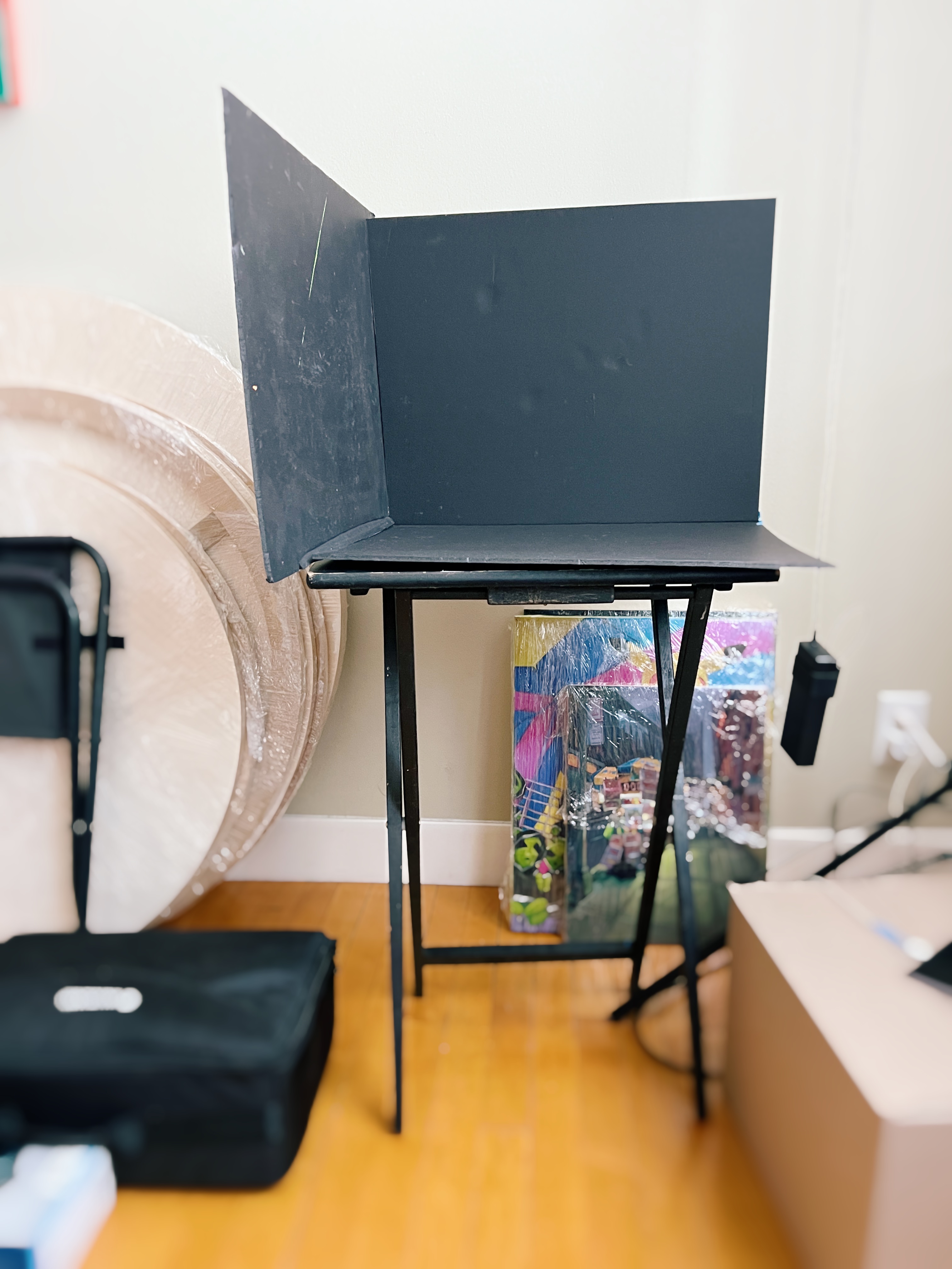
Shadow Box & Objects
If you’re building a shadow box, you’ll need three black panels (foam board or cardboard), a focused light source, and assorted colored papers. Objects progress from simple to complex: toilet paper rolls, cubes, fruit, glassware, fabric, bread, vessels, flowers, and more. You can get creative as you go. If you don’t have the space or energy for a shadow box, I’ll provide reference photos you’re welcome to use.
A Final Note
More than any material on this list, I encourage you to bring a learner’s mindset. Even if you’re already making strong work, there’s something powerful about returning to the fundamentals with patience and humility. I’m genuinely excited to work through this alongside you—and to re-train my own eye in the process.
WANT MORE PAINTING EXPERTISE?
Sign up for the Not Sorry Art School newsletter for exclusive offers, course updates, free perks and more!


