When Is An Orange... Orange? And Where? Project 5 "How To See Color & Paint It"
Apr 13, 2026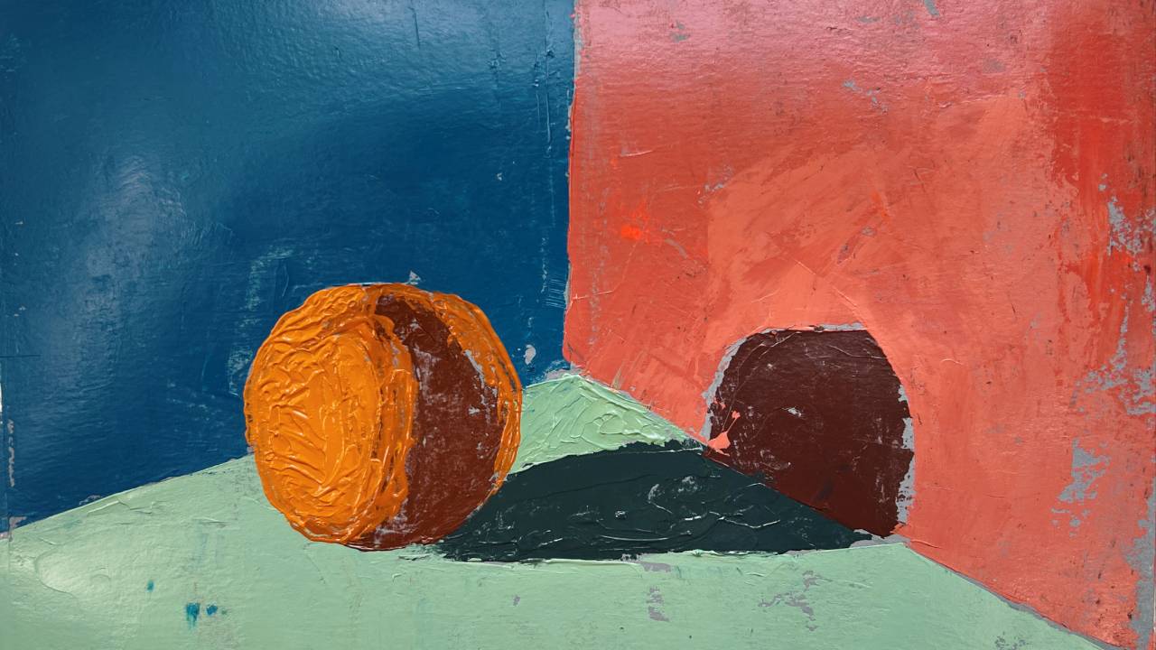
This week in our continued lessons from Arthur Stern's How To See Color & Paint It, we moved beyond cubes and into something slightly trickier: the sphere. In the fifth project, Stern asks a deceptively intricate question: when is an orange actually orange—and where?
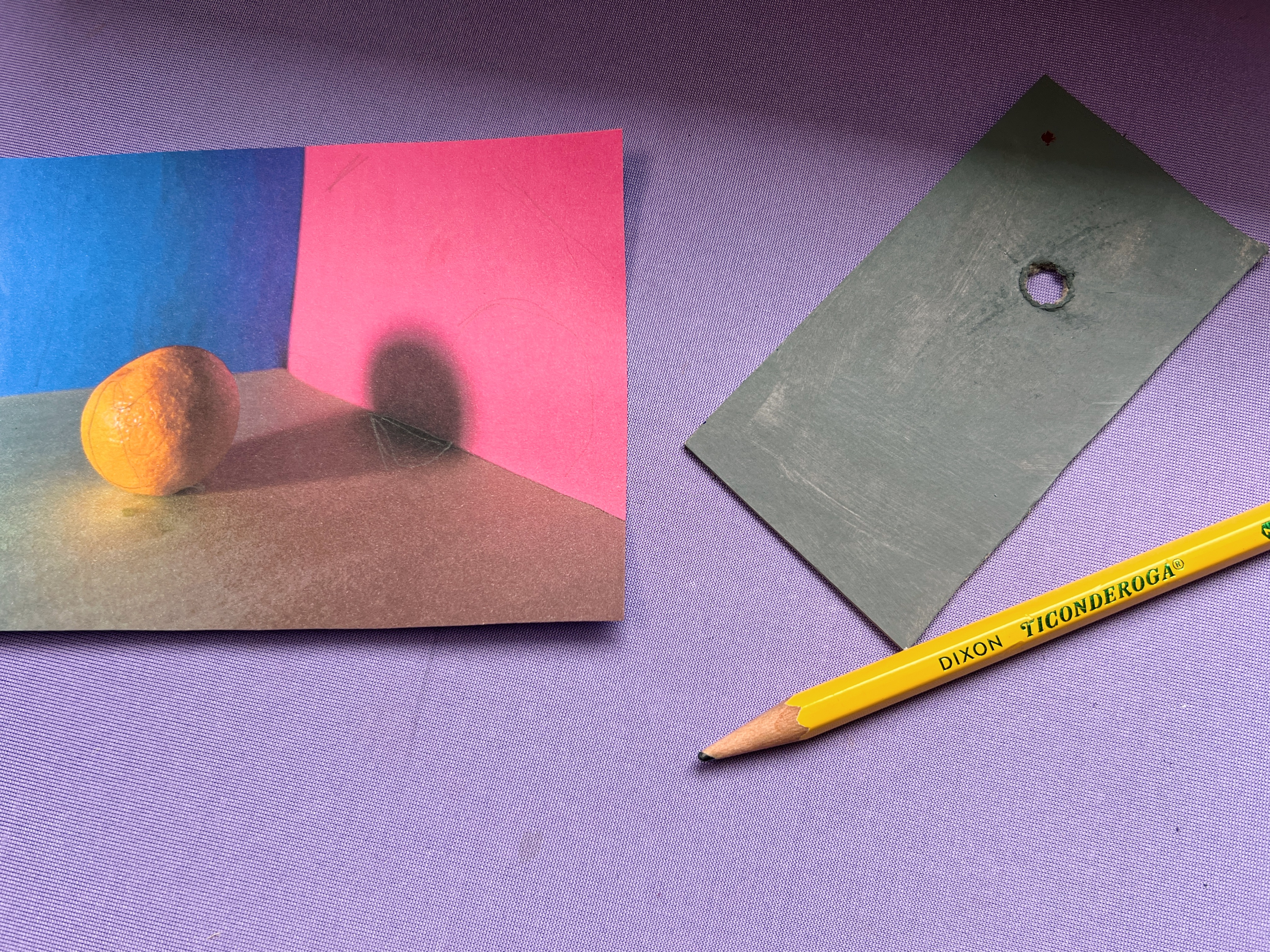
At this stage, we’re still working with first, second, and third statements—moving from general to specific. What becomes immediately clear is how lumpy and irregular the orange appears when reduced to just three value/color relationships through a viewfinder. It barely reads as spherical at all. And that’s the point.
If you trust the process and continue refining those initial statements into more specific ones, something clicks. Through careful observation of value, color, and chroma, the form resolves into a sphere. Not because you forced it, but because you described it accurately enough for the illusion to emerge.
Building the Form
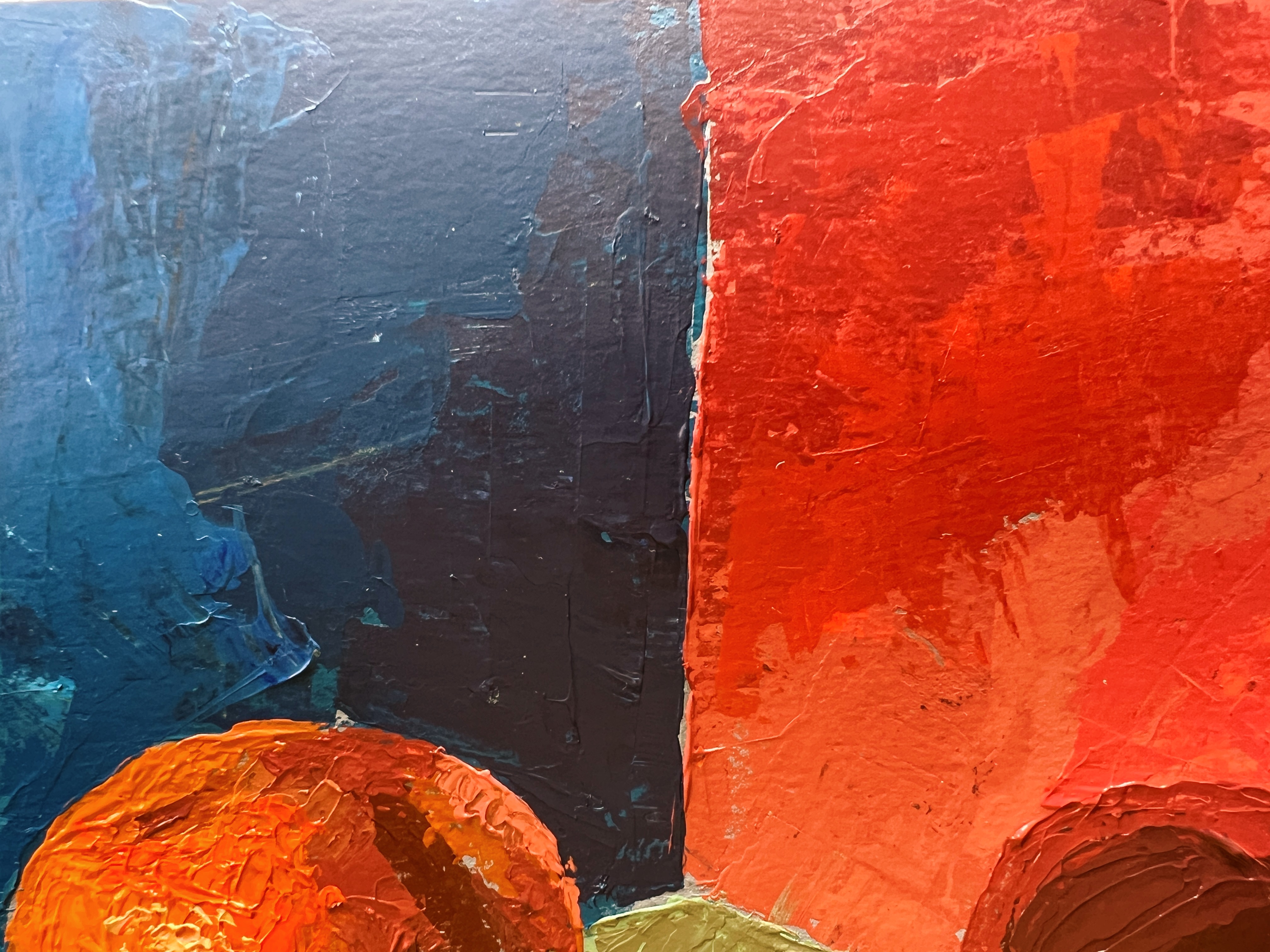
In my demo, I approached this similarly to the cube exercises—thinking in terms of planes first. I mixed deliberately, establishing relationships rather than chasing detail. One key idea: edges create effects. The edge of a shadow is what allows it to read as a shadow.
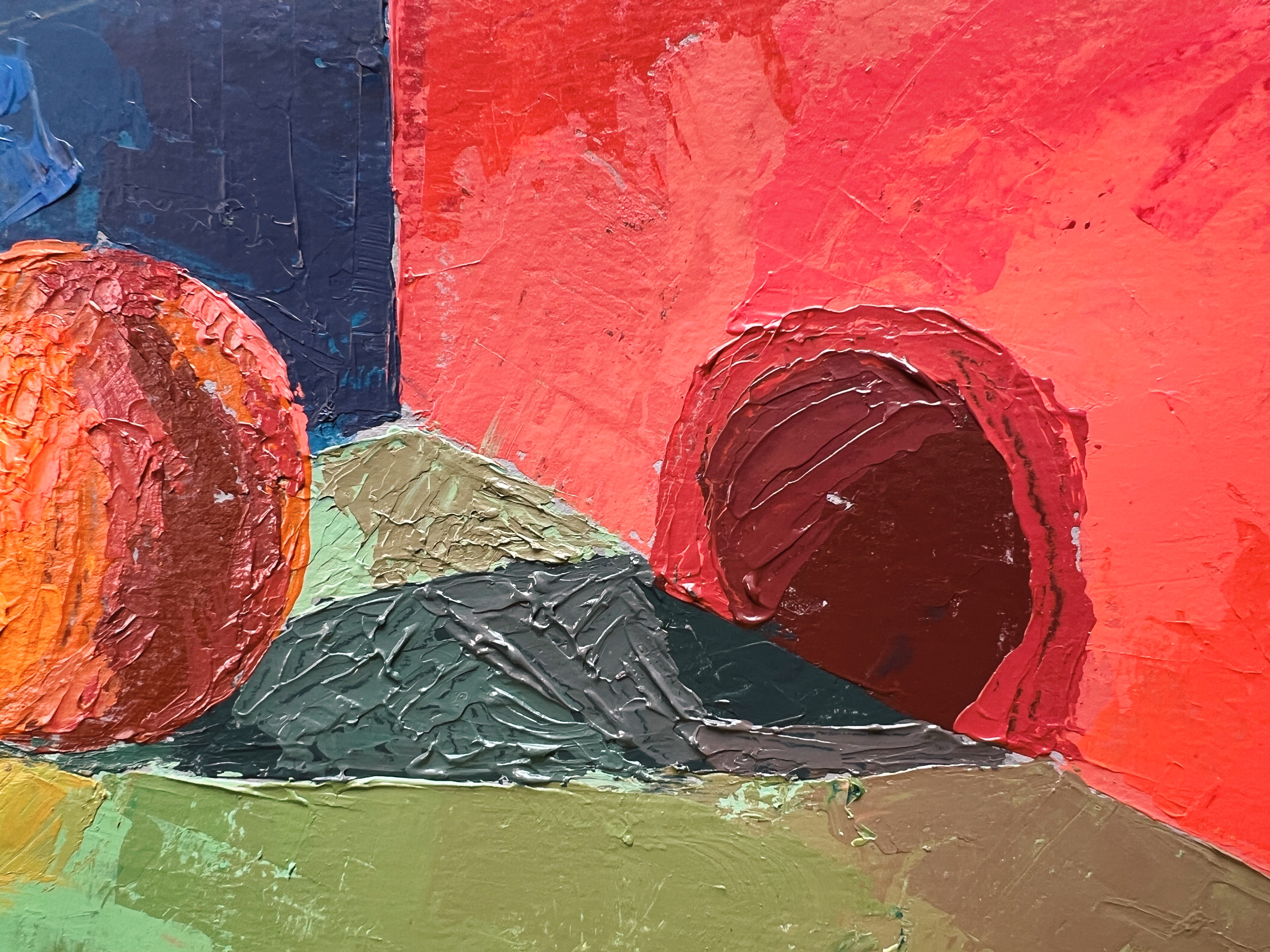
Where Is the Most “Orange” Orange?
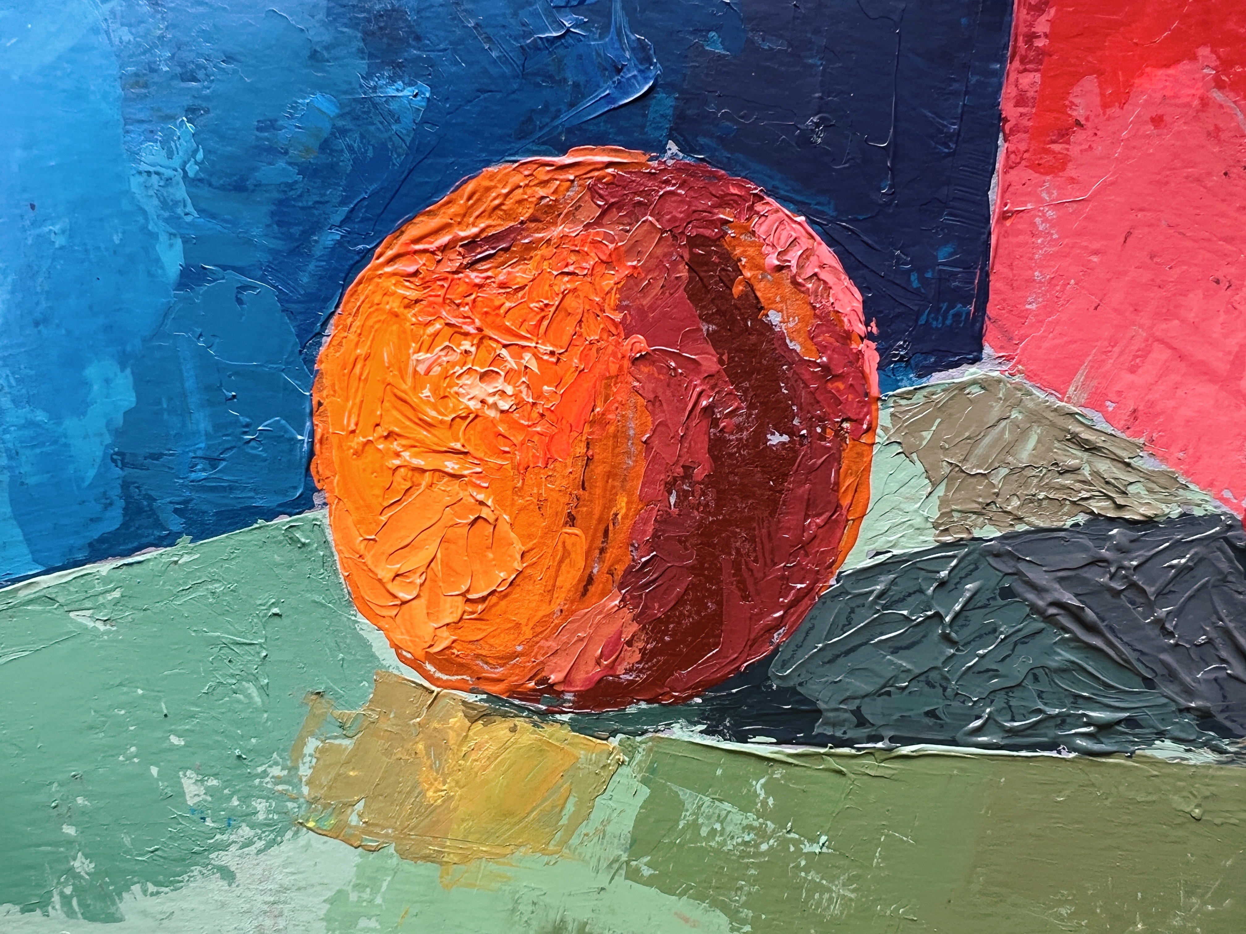
A major focus in this project is chroma—specifically, where it lives on a spherical form. One common mistake is placing the most saturated (chromatic) color arbitrarily—often in the half tones or on the far side of the light. But typically, the highest chroma occurs near the area receiving the most direct light (often close to the highlight, though not always exactly at it). Why? Because light enables color.
The more direct the light, the more fully a color can express its chroma. This is something cameras often distort or flatten, which is why painting from life is so valuable. When working from photos, you have to mentally compensate, remembering that chroma generally intensifies as light increases.
In my orange, even though the light moved from left (light) to right (shadow), the lower portion—closer to the ground—was slightly less chromatic.
This is due to two factors:
- It receives less direct light
- It’s influenced by cooler, green bounce light from the surface below
The Trap of Bounce Light
Speaking of bounce light—this is another place students tend to overshoot. That reflected light in the shadow can feel incredibly bright by contrast. But it’s crucial to remember: bounce light should never be lighter than the light side of the form. If it is, the illusion breaks. It may feel bright next to the core shadow, but it must remain subordinate to the primary light source in order for the form to hold together.
Color Echoes and Observation
One of my favorite moments in this study was observing the orange subtly reflecting onto the green ground—introducing a warm, orange note into the surrounding space. These small color echoes are where still life painting becomes especially rewarding. At its core, this kind of painting is an act of observing physics in real time. Light isn’t static—it’s fluid, reactive, and constantly shifting depending on context.
Final Thoughts
This project felt like a turning point in the book’s instruction. It’s where the exercises begin to feel less mechanical and more like real painting. I’m excited for what’s next.
And keep an eye out—my Applied Color Theory course is coming soon to Not Sorry Art School. Part of why I chose to teach through this book is because so many of its ideas overlap with what we’ll be exploring more deeply there. Stay tuned!
WANT MORE PAINTING EXPERTISE?
Sign up for the Not Sorry Art School newsletter for exclusive offers, course updates, free perks and more!


