Color Without Contour — Practicing Lost Edges (Project 6 "How To See Color & Paint It")
Apr 27, 2026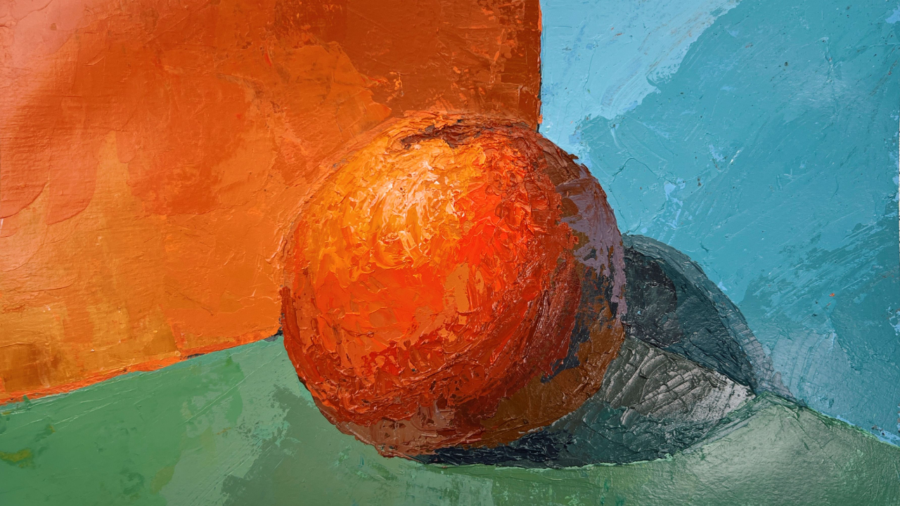
We’re heating up. At this point in our journey through How To See Color & Paint It, the projects are getting more challenging, more nuanced, and frankly, more fun. This week, we’re diving into Project 6: Color Without Contour. The central idea here is something painters talk about all the time, even if Arthur Stern doesn’t name it directly: lost edges.
Stern’s approach is a little more indirect. Rather than telling us to “lose edges,” he asks us to rely on subtle value shifts within a form—in this case, a spherical object—to describe it. Instead of carving out an object with line, we let color and value do the work.
Imagine you’re painting a coffee mug. Your goal is for the viewer to recognize it as a mug sitting on a surface. When we struggle to see and mix the subtle value relationships that create that illusion, our instinct is to fall back on drawing—to outline the mug so it reads clearly. I see this all the time with newer painters.
The tricky part is that while drawing is foundational to representational painting, we don’t use it the same way we would in a pure contour drawing. Instead, we rely on the skills drawing gives us—proportion, scale, placement—to organize our shapes. From there, it’s color and value that actually create the illusion of form.
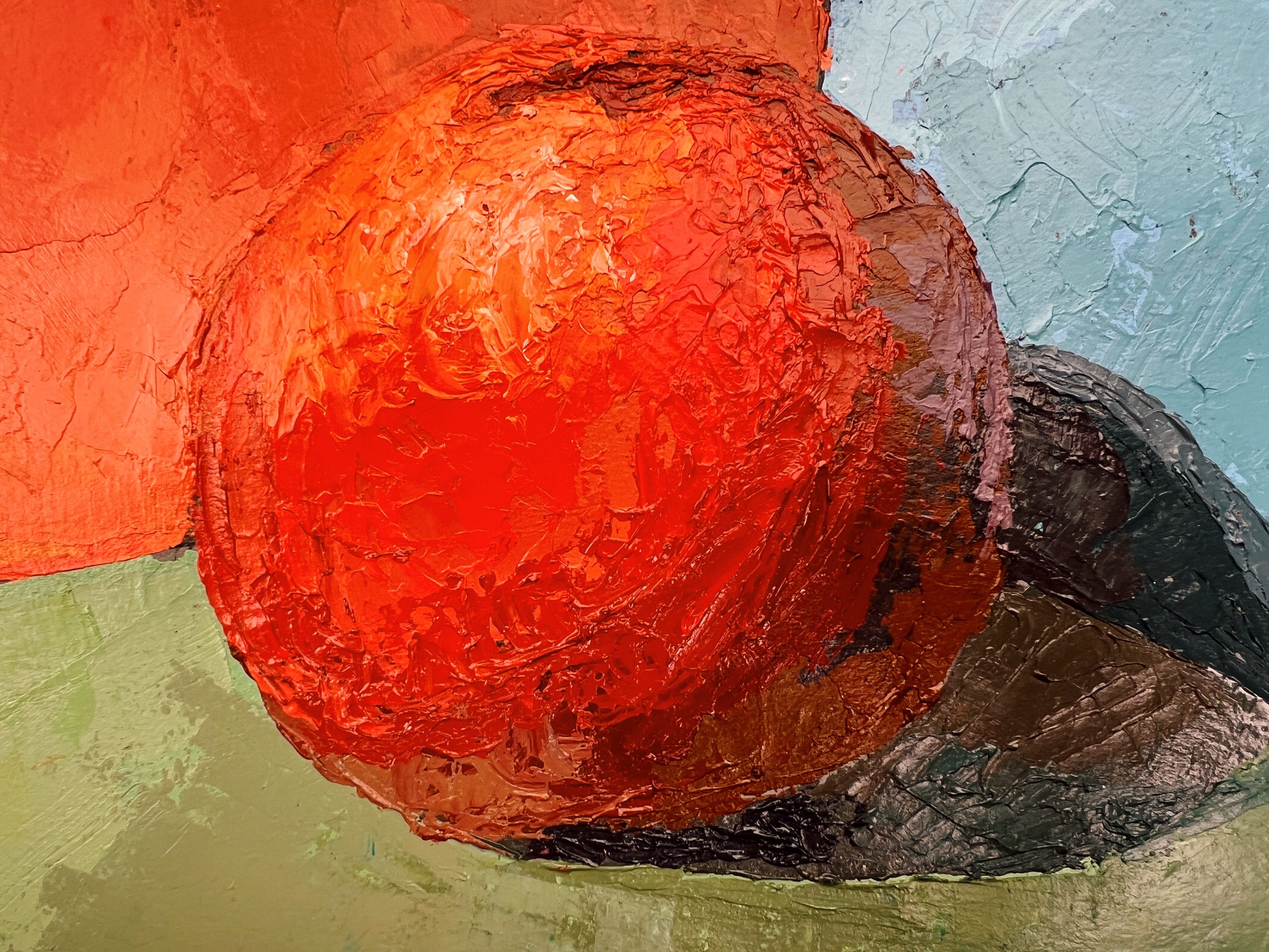
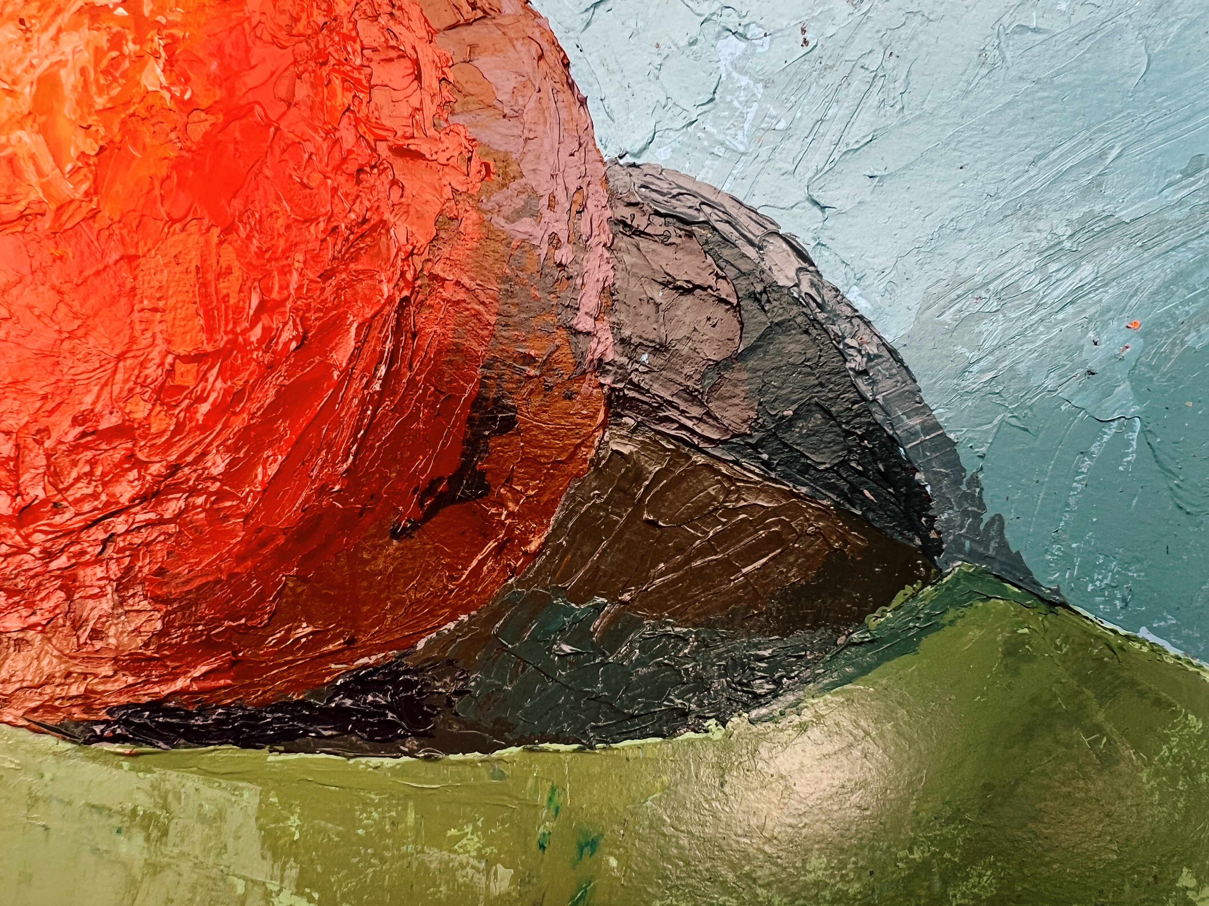
So, that’s a long way of saying: resist the urge to outline your subject. Yes, outlining might make the object legible. But it also creates a visual contradiction. You end up with two competing systems: flat contour lines and dimensional color relationships. The result often reads as hesitant or beginner-level, even if your instincts are pointing you toward something more painterly. This is where lost edges come in.
The Assignment: Painting with Lost Edges
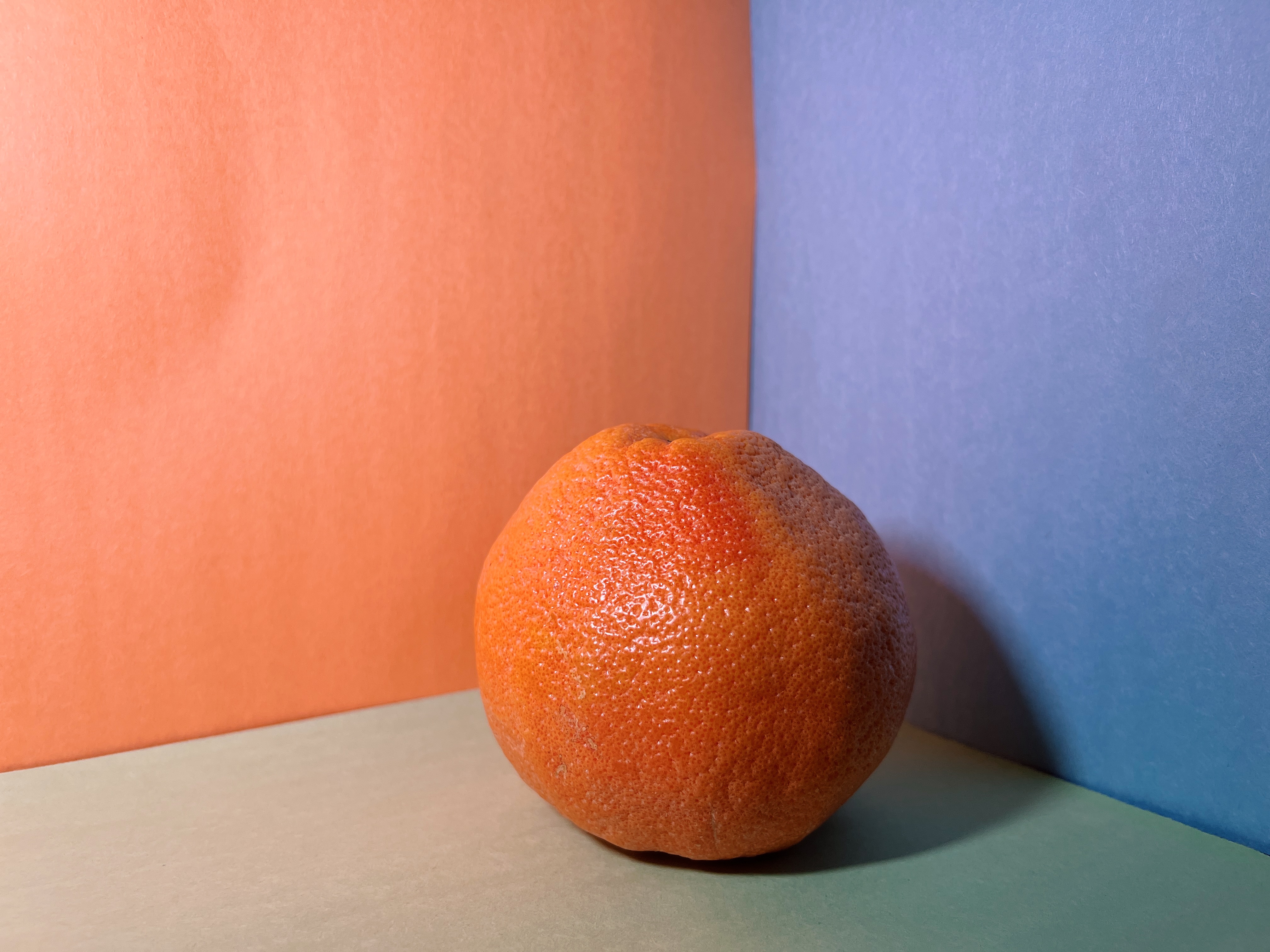
In this project, Stern has us paint a grapefruit placed against a wall that closely matches the color of its flesh. The goal is to eliminate clear boundaries in certain areas so that the form emerges purely through subtle shifts. A quick note on my setup: I went to the grocery store fully intending to find a grapefruit with yellow flesh. No luck—everything leaned pinkish-orange. So I adjusted and chose an orange background instead.
Yes, I’m aware this means we’re painting yet another orange citrus right after my previous demo. I had the same thought. But for the sake of the exercise, the color relationship mattered more than novelty.
Finding Your Color Spots
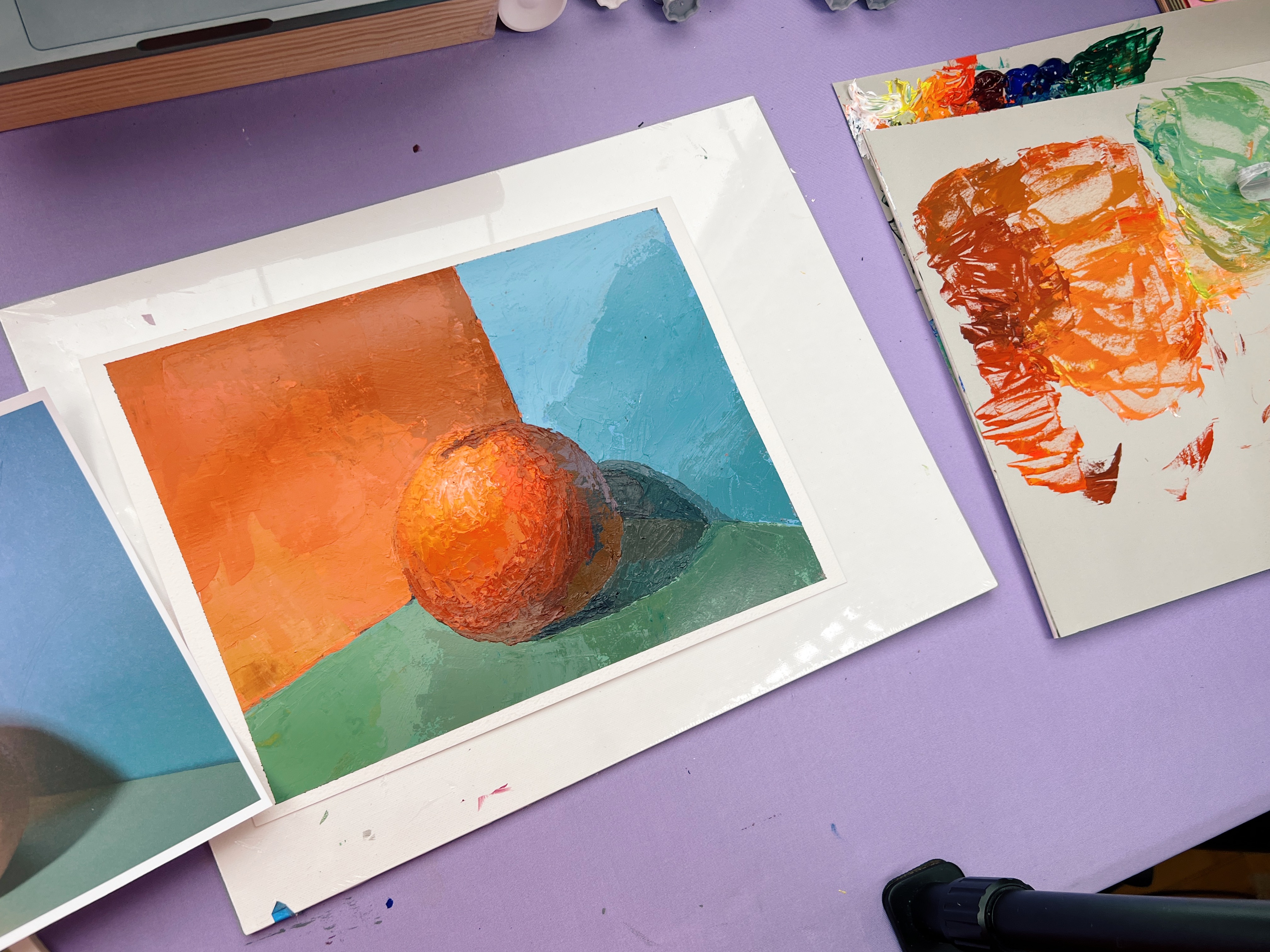
Stern encourages us to begin by identifying six major color spots. In my setup, I found seven—the cast shadow on the blue wall felt distinct enough to deserve its own category.
From there, the process expands: Within each of those larger color areas, you look for smaller variations. Stern suggests finding four within each zone, and in some areas—like the wall—that was sufficient. But in others, especially the flesh of the grapefruit and the cast shadow, I pushed much further. This is where the painting really starts to come alive. I let myself lean into the subtlety—the tiny temperature shifts, the slight changes in value. The cast shadow, in particular, became one of the most rewarding parts of the piece.
A Note on Shadows
We talked about this in the live session, but it’s worth repeating: Shadows should be more compressed, more muted, and less detailed than the light. Less contrast. Less vibrancy. Less information. For example, when painting the surface of a citrus fruit, you might carefully render the pores and texture on the lit side—but intentionally leave that information out on the shadow side.
When something is in shadow, it simply contains less visible information. It plays a supporting role in the composition. And if you over-describe it, you flatten that hierarchy and lose clarity. This principle shows up everywhere, especially in portrait painting.
There’s also a physiological component: when we look into shadow, our pupils dilate to gather more light, allowing us to perceive more detail. But in painting—especially when working from an impressionistic mindset—we’re not trying to replicate that prolonged inspection. We’re painting the initial impression. Which means we have to actively resist the urge to overpaint the shadows.
Trust the Process
One thing you’ll notice in this project is that the reference photo may show clearer edges than you actually perceive in real life. That’s normal. Cameras tend to exaggerate contrast and separation. Your job is not to copy the photo literally, but to trust your observation and the logic of the exercise. Let edges dissolve where they naturally want to. Let form emerge slowly through relationships.
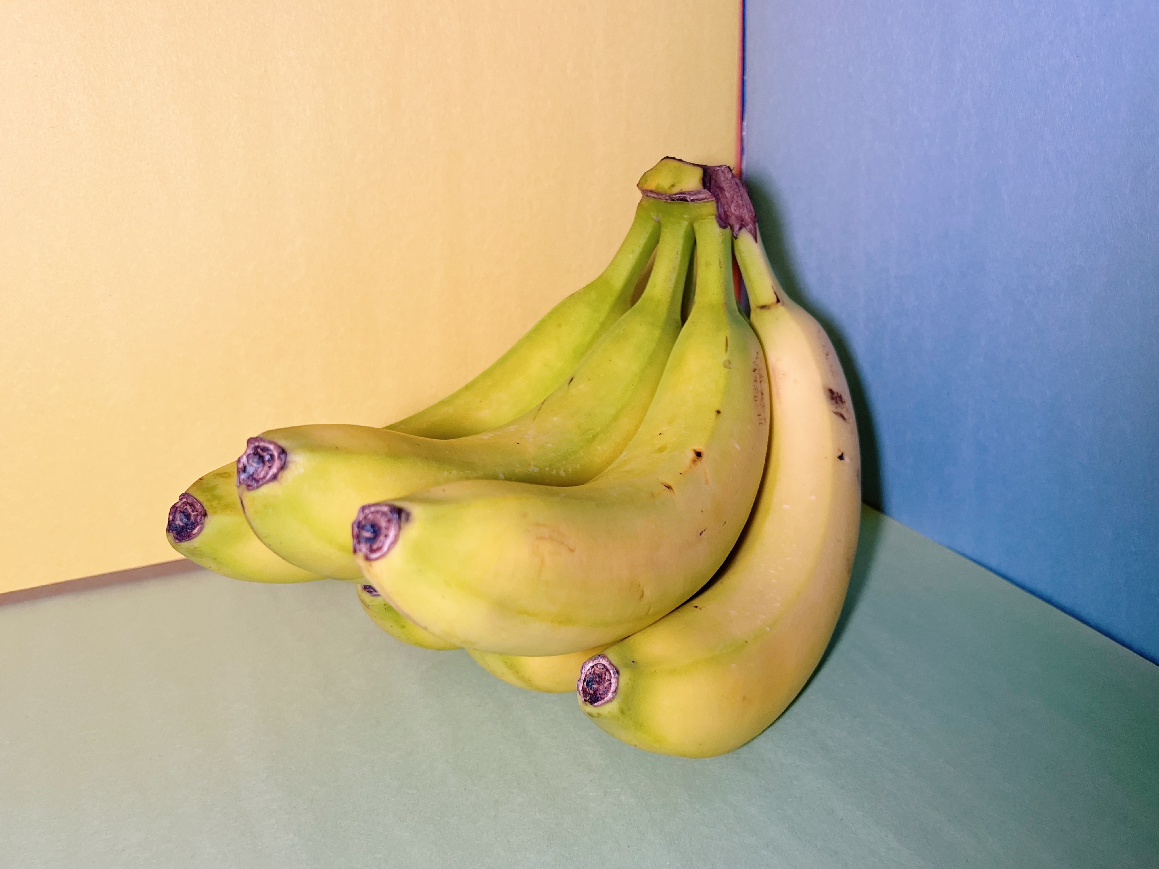
Optional Reference: Bananas
I’ve also included a second reference image—a bunch of yellow bananas—for anyone who had their heart set on working with a yellow subject this week. The same principles apply.
Final Thoughts
Thank you to everyone who joined the live session. These projects get better every time I get to talk through them with you, answer questions, and work through the painting in real time. If you’d like to join us live, ask questions, and treat these sessions like office hours, you can become a Lifetime Access member of Not Sorry Art School. I walk through each project step by step, translating the lessons from this (sadly out-of-print) book into something practical, approachable, and actually usable in your own painting practice.
See you in two weeks!
WANT MORE PAINTING EXPERTISE?
Sign up for the Not Sorry Art School newsletter for exclusive offers, course updates, free perks and more!


