Black and White In Light and Shade: Project 8 "How To See Color & Paint It"
Jun 01, 2026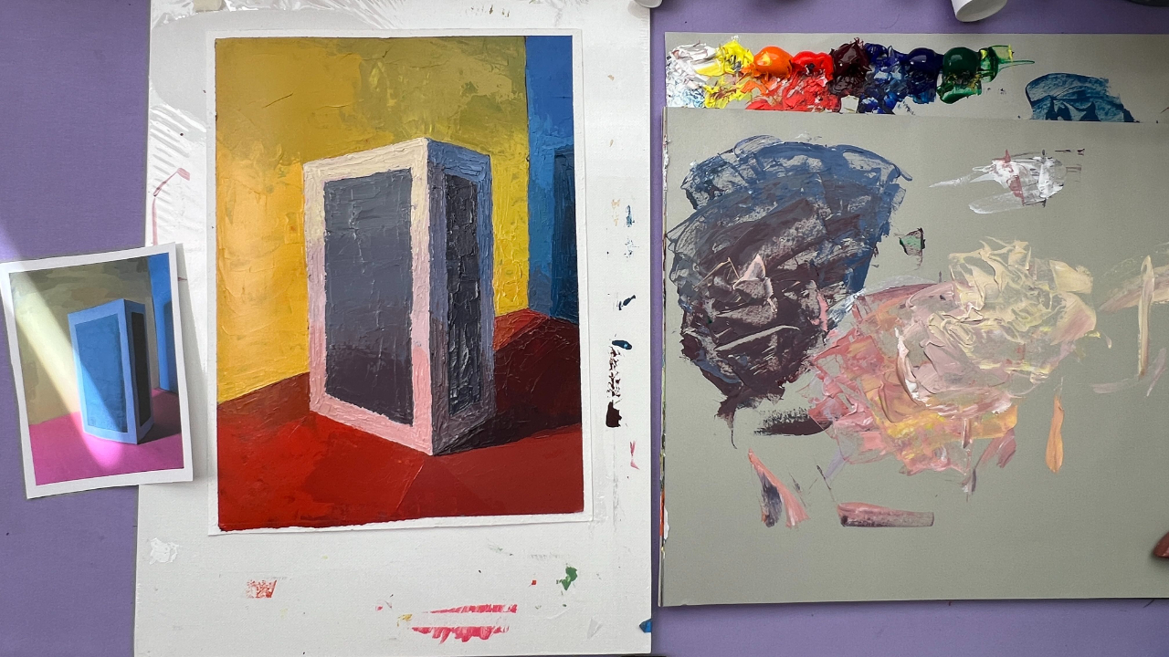
We're finally on to Chapter 2 with Project 8 in Arthur Stern's How to See Color and Paint It, and this might seem like a bit of a backslide, as we're once again working in grayscale. However, this project takes the lessons we learned in Projects 1 and 2 and elevates them with complexity. Admittedly, ever the fan of value studies, I'm partial to this exercise and think it can teach us a lot about the nature of reflected light.
Project 8 Live Demo - Recording
I once heard that painters have to embrace physics when they paint representationally, and that still lifes in particular give us a chance to really see how light can bounce and play off of different surfaces. This exercise shows that in detail.
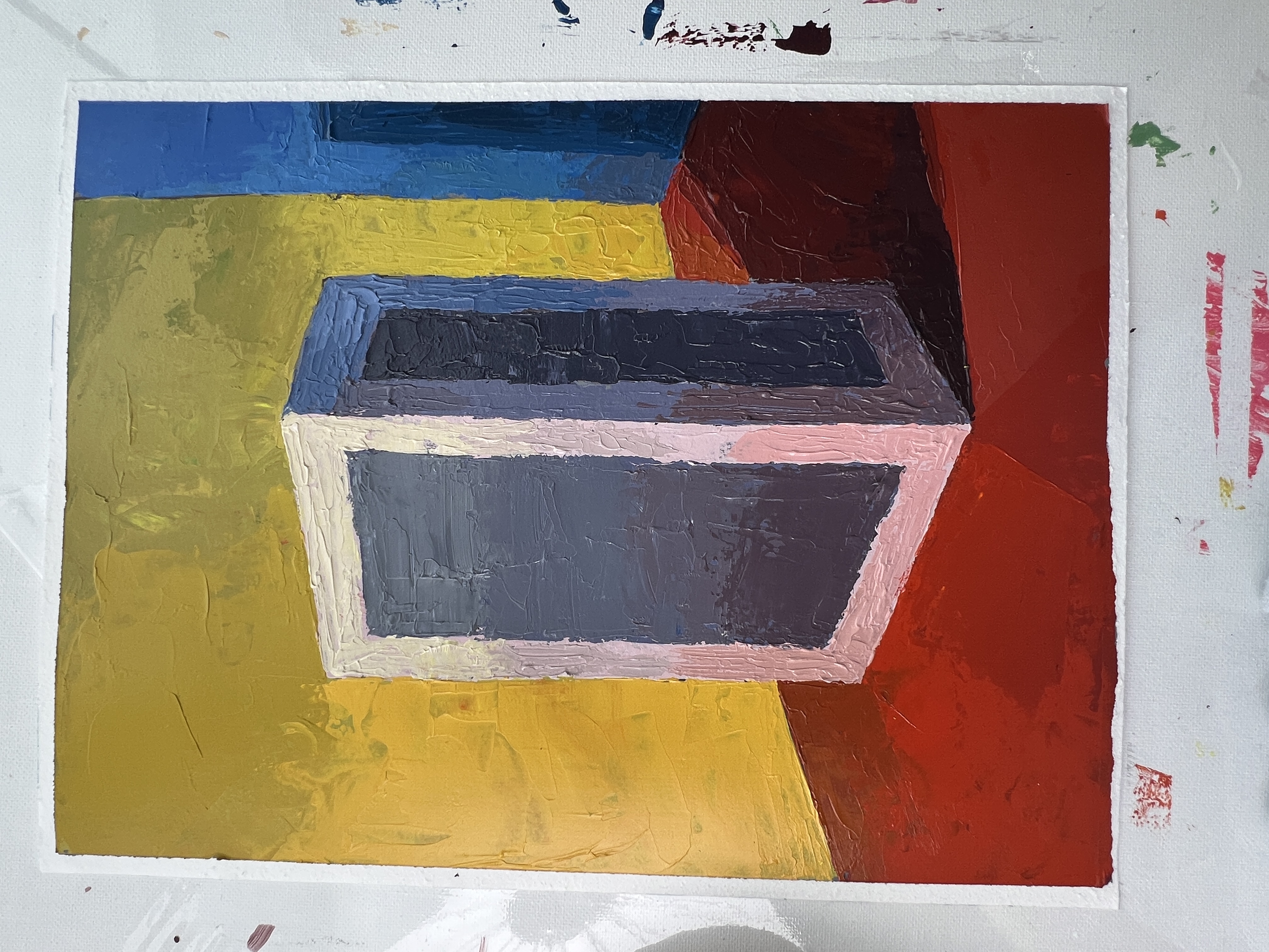
For the setup, Stern asks us to use our primary colors in our light box once again. He then asks us to take a cereal box or a small box with dimensions of 3" x 5" x 7". (Side note: this is a reminder that the book was written in the 1960s, because by family-size Cheerios box dwarfs these dimensions.) I found that a Kleenex box works well. I taped white paper to the outside and then created two panels of black paper taped to the surface, giving us a surface that is both black and white, as well as a surface in direct light, and one in cast shadow.
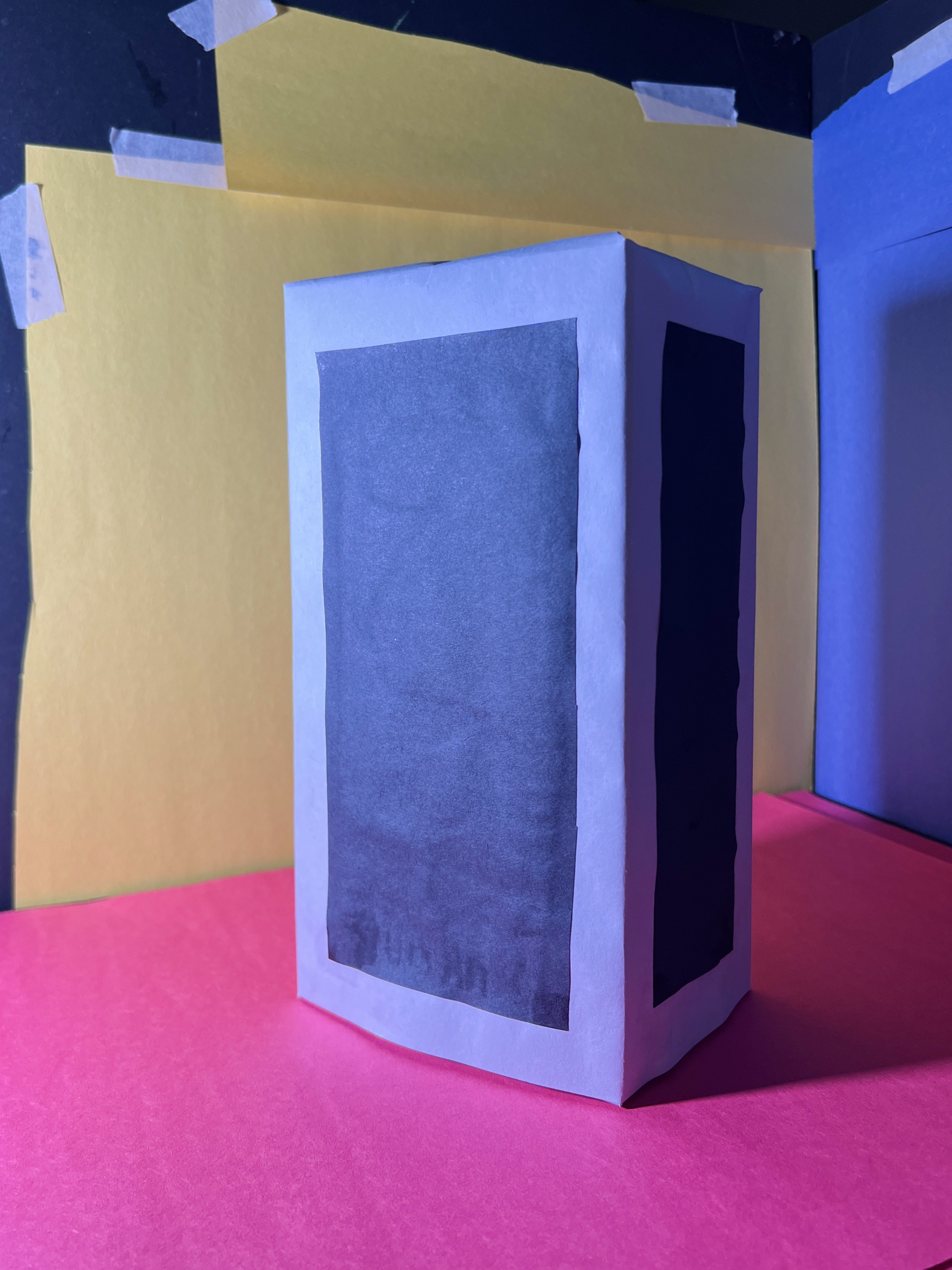
This sets up one of the most satisfying moments from the book so far — the lit black cardboard is the exact same color and value as the shaded side of the white box. A white piece of paper, when turned into shadow, is as dark as black. Once again, this reinforces the idea that color is very negotiable and entirely influenced by light. If you can embody and understand this lesson, you've fully graduated from this principle.
Unlike the first two projects where we examined black and white, we are doing our full three-statement analysis. In our first statement, including the reference photo I've provided here, we get most of the feeling of the painting. We're finding one solid color for both colors on the front, both colors on the side, and then all three walls plus the cast shadow. My reference photo doesn't include the top of the box, but feel free to take your own to capture that as well.
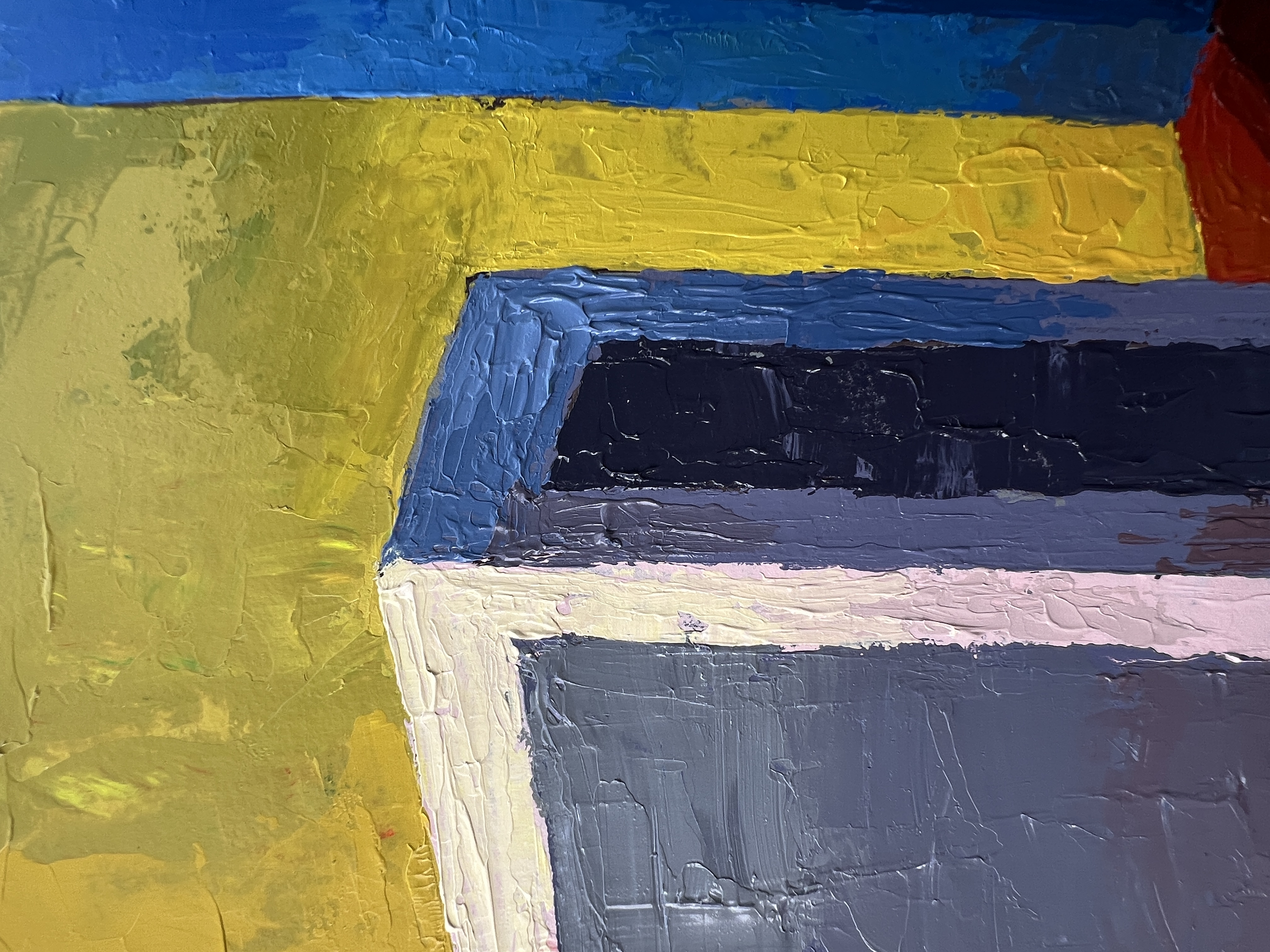
What I find most interesting is that in the second and third statements specifically, we're able to see the effect of the red light bouncing onto the white part of the box. It also gives us a chance to observe something helpful: some colors bounce light more intensely than others. A black piece of construction paper is going to absorb more light than a white piece, even when they are on the same plane receiving the same intensity of light.
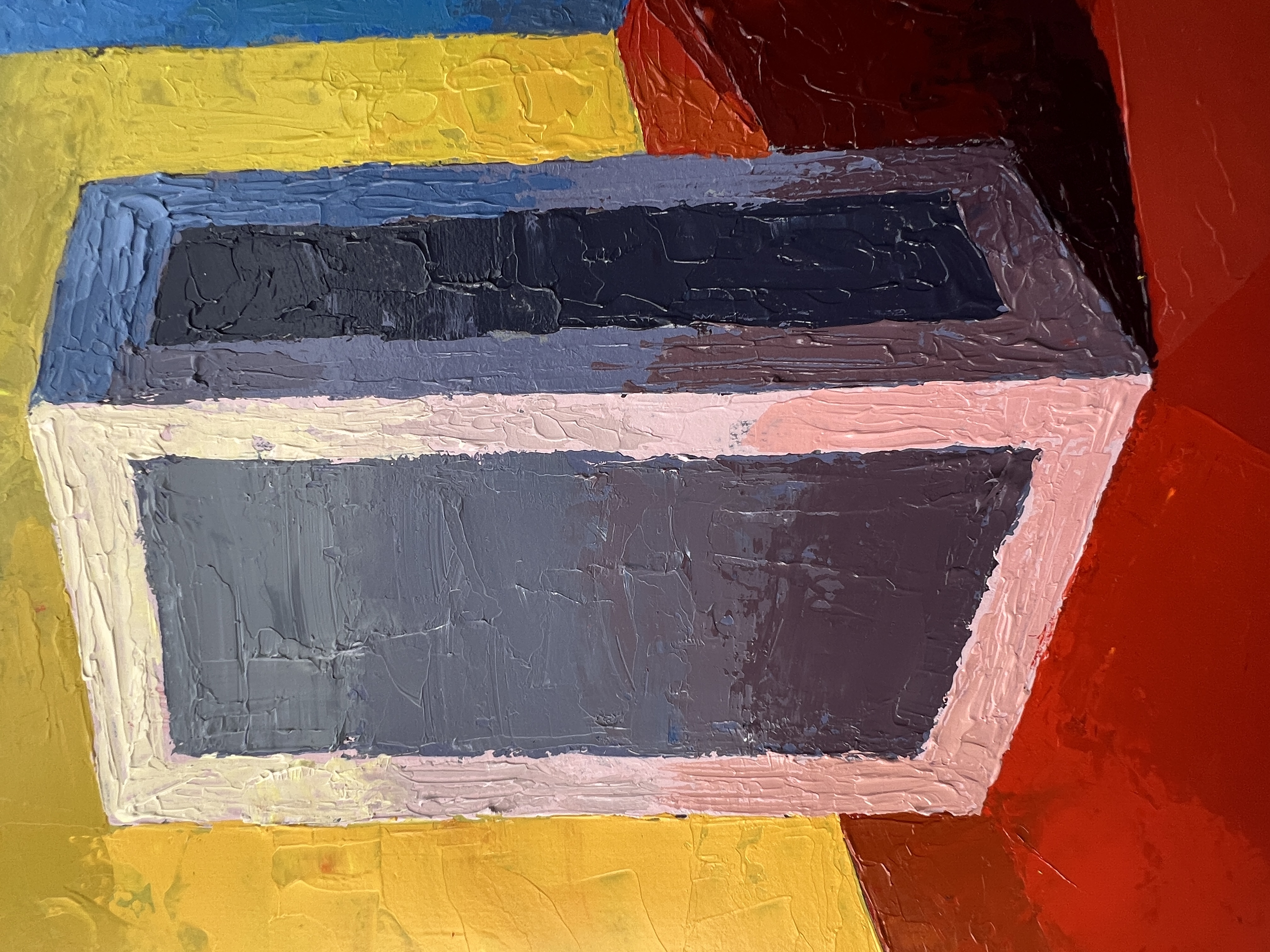
A clear example of this appears in the third statement, where the black construction paper on the shadow side of the box reads as one uniform dark value, whereas the shadow side with the white construction paper shows undulating values and chroma — because the white paper is reflecting more light. If you've ever lived in a hot climate, you know that wearing white keeps you cooler than wearing dark colors. Black absorbs more light and heat energy, while white reflects it back — both into your eye and away from the subject.
One last thing: we're approaching the part of the book where I can feel myself genuinely improving. I'm finally getting better at the palette knife and internalizing these lessons, even though this is my second time working through the book. So much of learning is building up an arsenal: both head knowledge and the knowledge that lives in your body when you do something over and over. If you're doing this exercise alongside me, I hope you're feeling more confident in your statements and more at home with the program.
Looking ahead to Project 9, the next lesson will be painting fabric, something I'm especially partial to as I have an entire Not Sorry Art School course called Fabric and Pattern.
I should also mention that Applied Color Theory has just released — my favorite course to date, and perhaps the most immediately useful one yet. It covers three sections: one focused on Josef Albers' teachings on color context, another on the power of limited palettes and color wheel analysis, and finally the relationship between color and light. These lessons will immediately improve your skill. If you've ever wanted to become a Lifetime Access student and you're on the fence, now is a great time to join.
This Sunday June 7 at 10:00am CST, I’m hosting a FREE Applied Color Theory webinar where I’ll demo an exercise from the course live and answer your questions via a Q&A. Color is the aspect of painting and design that brings life to your work — knowing what factors influence your perception of color will immediately improve your paintings. Don’t miss out on this opportunity to make those improvements right away.
But hurry! Spots are limited for this free webinar and you won’t want to miss the special offer I’m providing the attendees.
WANT MORE PAINTING EXPERTISE?
Sign up for the Not Sorry Art School newsletter for exclusive offers, course updates, free perks and more!


