Seeing Color: Vocabulary, Mixing, and How to Actually Use Your Color Wheel
Feb 03, 2026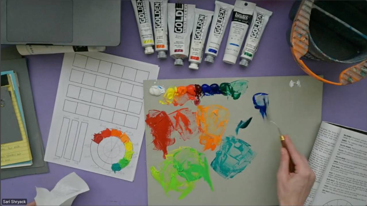
This blog post accompanies the February 2 two-hour live session, where we walked through the most important conceptual chapter in How to See Color and Paint It by Arthur Stern. In the live, we introduced key vocabulary, discussed how Stern thinks about color, and built his black-and-white color chart into a fully painted, working color wheel.
If you haven’t yet read the previous blog post about materials and how this book is structured, I recommend starting there before moving on — it explains what you need, how to set up your palette, and how to use these exercises as studies rather than finished paintings.
This chapter may be short, but it is arguably the most important section in the entire book. Everything that follows — all of the still lifes, all of the color matching, all of the painting — depends on the ideas introduced here.
Let’s break it down.
Palette Knives: Why Stern Cares So Much
Stern is very clear about two tools:
- A straight palette knife for mixing
- A diamond-shaped trowel knife for applying paint
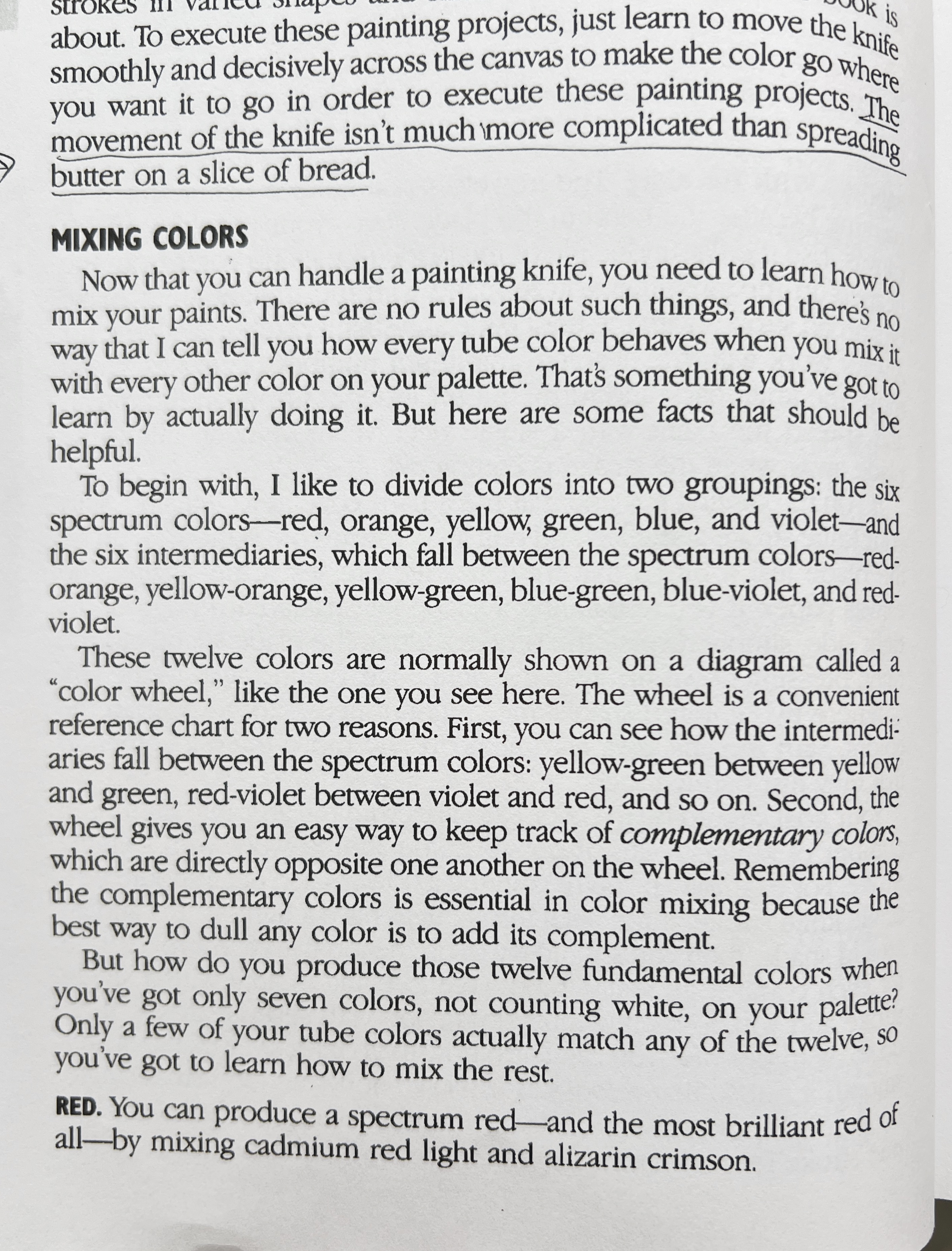
A palette knife is the best tool for mixing color because paint hides in brush bristles. That’s not always a bad thing — I personally use “dirty” brushes intentionally in my own work to create optical color mixing and harmony — but if your goal is to understand what a color actually is, you need clean, honest mixtures. A knife also wastes far less paint.
The trowel-shaped knife matters because it lets you lay down clear, flat statements of color. You are trading brushy texture for accuracy. That is the point of these studies.
Stern says:
“The movement of the knife isn’t much more complicated than spreading butter on a slice of bread.”
That’s the spirit here. You are not trying to become a master palette-knife painter — you are learning to see color without it being obscured by technique.
If it feels clunky at first, that’s normal. If it helps, practice with leftover paint on a coloring page, a Zentangle, or a simple illustration like a flower or succulent. You are just getting used to the tool.
The 12-Hue Spectral Color Wheel
Stern organizes color into 12 spectral hues — meaning colors at their most chromatic, the kind you’d find in a rainbow:
Red
Red-orange
Orange
Yellow-orange
Yellow
Yellow-green
Green
Blue-green
Blue
Blue-violet
Violet
Red-violet
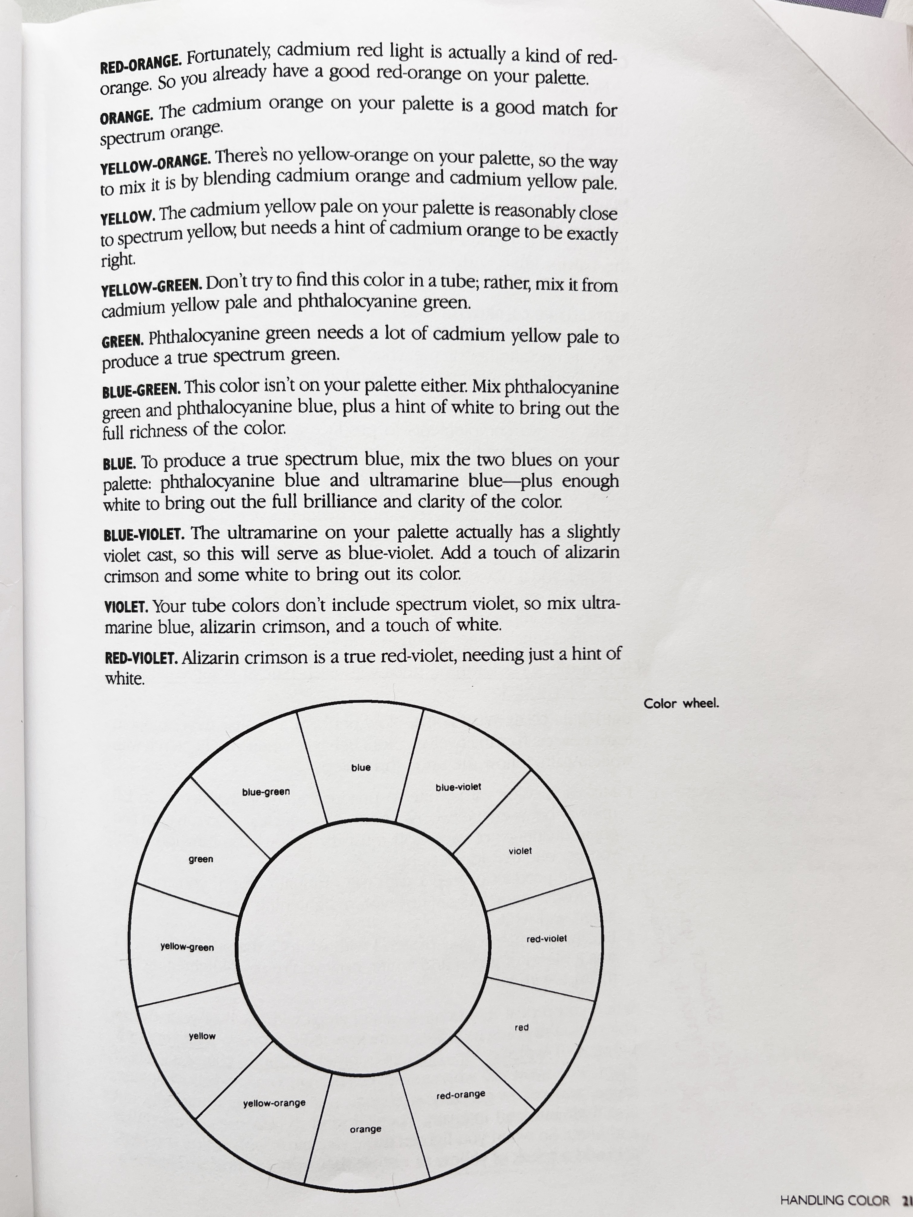
There is no single “correct” color wheel. Color language shifts across cultures, history, and paint systems. But for the purposes of this book, we are honoring Stern’s system.
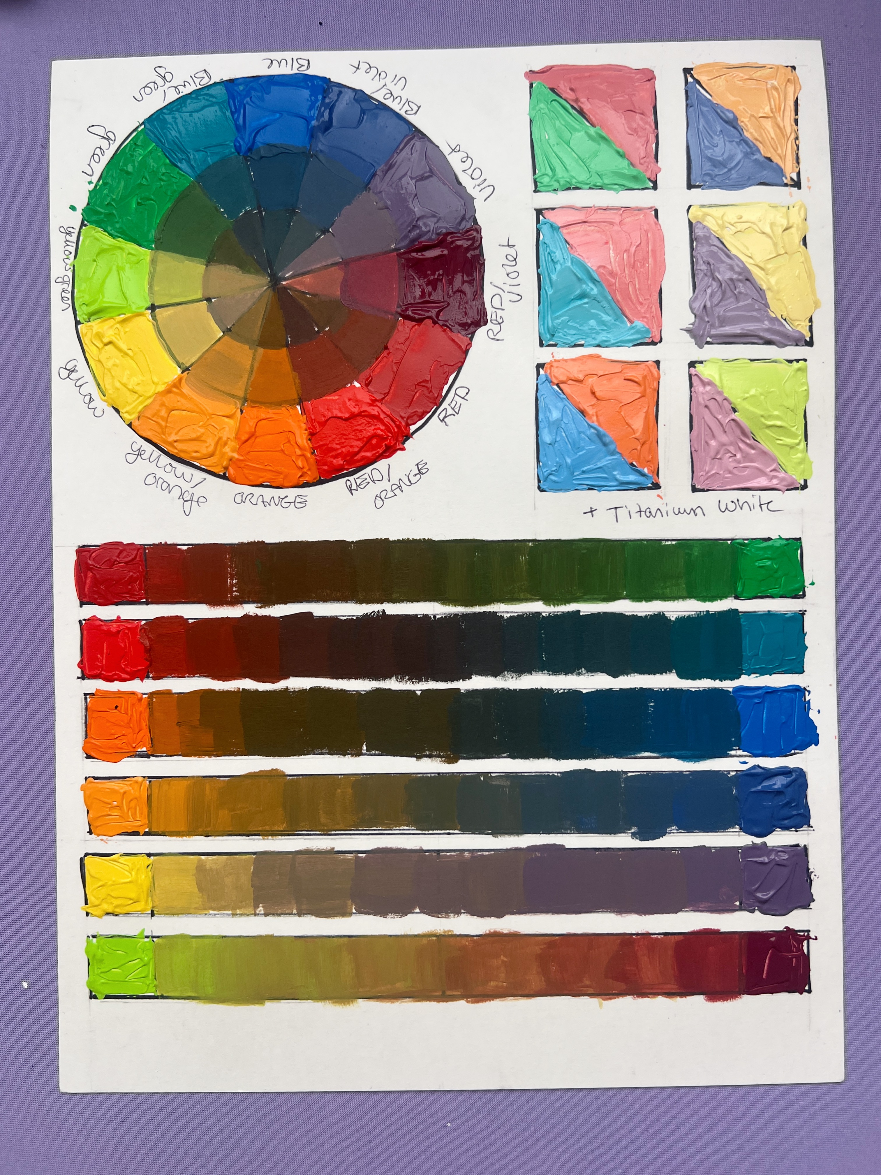
I’ve provided a printable PDF of his chart so you can mix and paint your own wheel the way we did in the live.
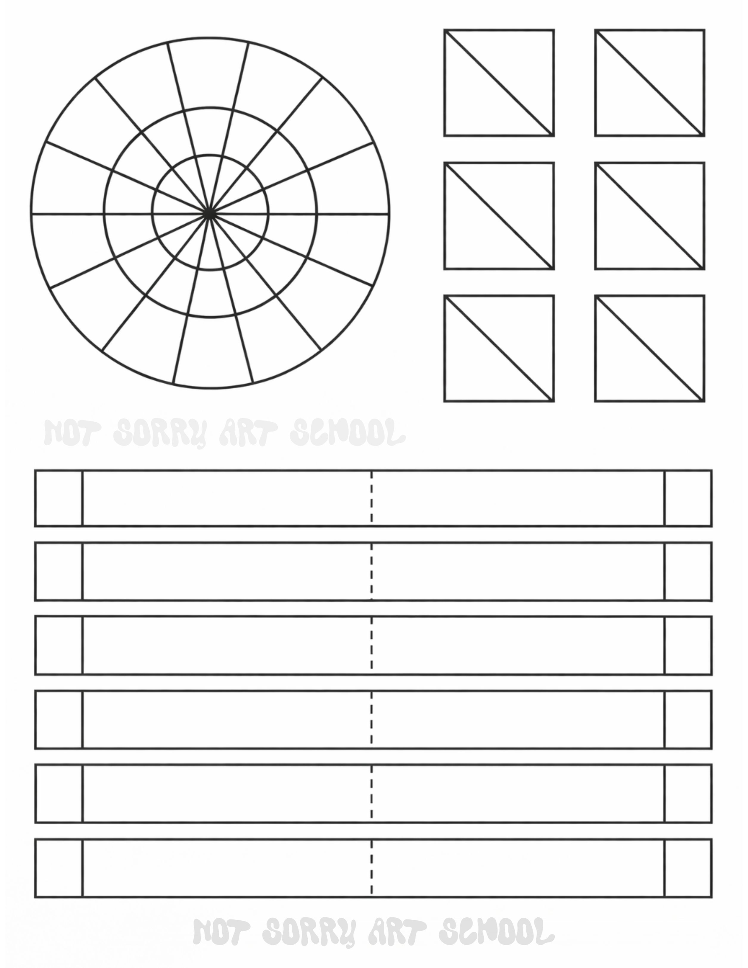
I created this custom color chart PDF specifically for How to See Color & Paint It. I divided the color wheel into 12 sections to reflect the 12 hues Stern outlines in the book.
There are three total rings: the outer ring shows the pure hues, and the two inner rings show each hue progressively mixed with its complement from across the wheel. This offers a visual representation of many muted hues—the so-called “dirty” colors Stern encourages us to avoid labeling as black, white, gray, or brown. Instead, we can identify them as low-intensity versions of a specific hue: low-intensity purple, blue, green, red, etc.
I also included six diagonally divided squares to represent all 12 hues plus white. I chose six containers simply for space, but the goal is to demonstrate how dramatically white shifts a color—often cooling it significantly. I always suggest treating titanium white acrylic as if it were a very, very light blue. This mindset helps you anticipate how strongly it can alter warmth and intensity, some colors more than others.
Finally, there are six rows representing the six complementary pairs (for example, red and green). Each row explores the full range of mixtures between the pair—low-intensity reds, low-intensity greens, browns, and sometimes a near gray in the center.
In perfect color theory, complementary pairs would create a true achromatic gray at their midpoint. In practice, because we’re working with imperfect, ground pigments, some mixtures get closer than others. In this chart, the yellow-orange and blue-violet mixture comes closest to a neutral gray. Others—like yellow-green and alizarin (violet-red)—remain warm throughout, suggesting both pigments lean warm.
You should mix these yourself. I used a brush, though a palette knife works if you’re up for the challenge. Once finished, I recommend making notes on the back of your chart—record specific observations, new neutral mixtures you discover, and how each hue behaves with its complement.
A Quick Pigment Note
In the live, I used alizarin crimson hue rather than true alizarin. Alizarin pigment is fugitive (it fades), so many modern paints use a hue formulation. I noticed this made my purples slightly less vibrant. That’s not a dealbreaker for what we’re doing, but it’s a good example of why pigment personality matters.
Why You Must Tint Everything With White
After mixing your 12 hues, Stern asks you to mix each one with white.
White does not simply make a color lighter. It shifts it — often dramatically — because white is cool-toned.
For example:
- Cadmium orange with white tends to pull yellow
- Pyrrole orange with white tends to pull pink
This is how you learn what each pigment wants to do. Think of every pigment as having a personality: opacity, tint strength, temperature, behavior with white. These charts are how you learn it.
Learning to Name Color (The Most Important Part)
Stern uses three coordinates:
- Hue
- Luminosity
- Intensity
In Not Sorry Art School, I use:
- Hue
- Value
- Chroma
Same idea, different language.
What matters is this:
The more color vocabulary you have, the more colors you can actually see. Instead of saying “brown,” you might say: low-intensity red-orange. Instead of “gray,” you might say: low-intensity blue-violet. Stern calls black, white, brown, and gray “dirty words” — not because they aren’t real, but because they stop you from identifying the underlying hue. Browns live on the warm side of the wheel. Grays live on the cool side. Find the hue first.
Matching Color: The Three Phases
This is the heart of the chapter.
Phase One: Knowing Your Pigments
What does this color do out of the tube? Is it opaque? Transparent? Strong? Weak? Cool? Warm? How does it behave with white? You learn this through labels, charts, and experience.
Phase Two: Matching Local Color
This is the literal color of the thing. The bark of a tree. The fabric of a shirt. The red of a magazine page.
Try this exercise:
- Rip out magazine pages or use paint chips
- Mix the closest match you can
You won’t always hit it perfectly — printers and pigments have limits — but the skill of getting close is essential.
Phase Three: Color in Context
This is color affected by:
- Light
- Atmosphere
- Reflected color
- Surroundings
Josef Albers called this the interaction of colors. Nothing exists alone.
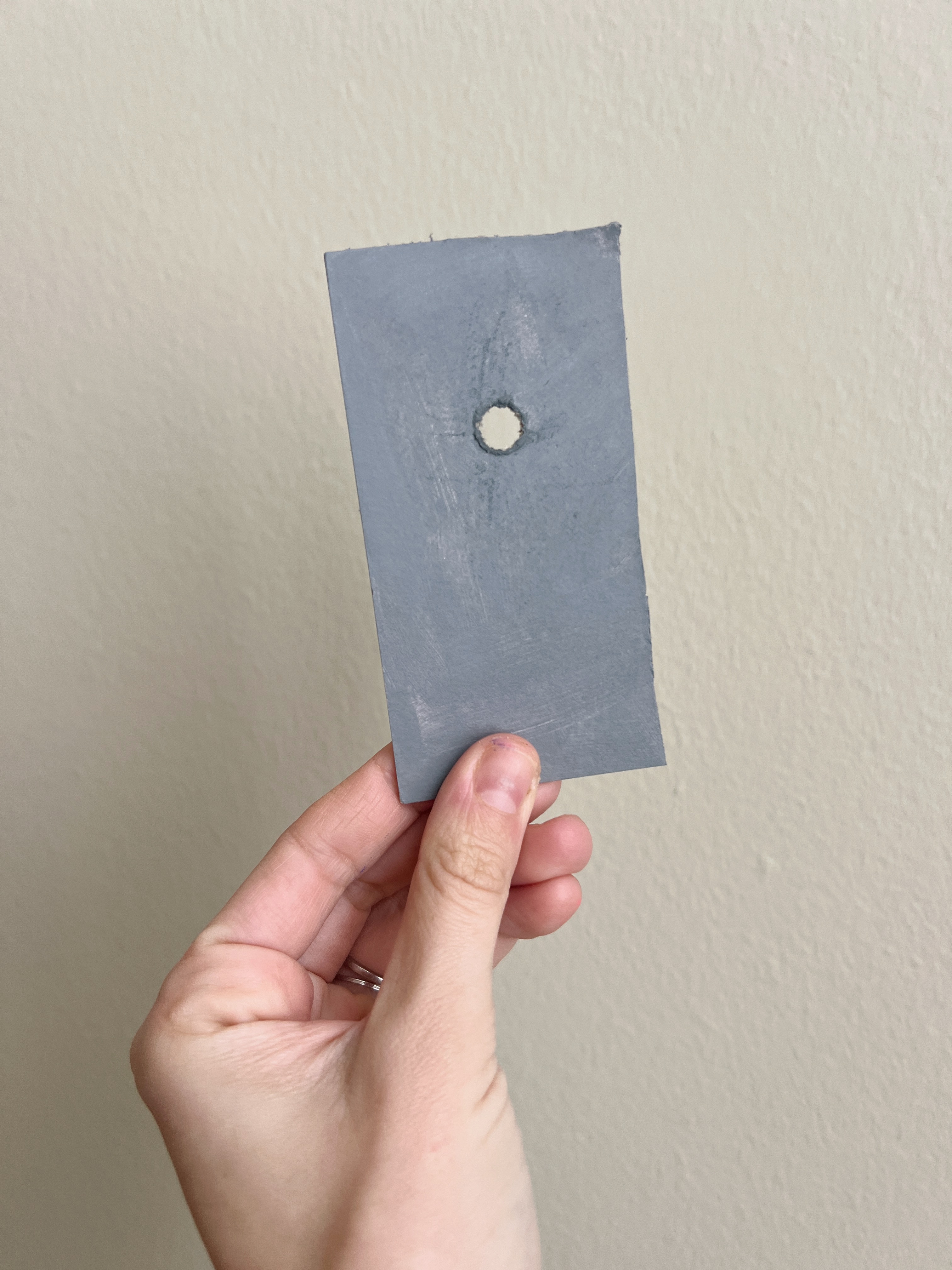
The Spot Screen
Stern recommends a gray card with a small pinhole — about the size of a pencil eraser — that lets you isolate a color against neutral gray. This removes context and lets you see what the color actually is. Use it! It works.
Mix What You See, Not What You Know
An orange in a tree is not grocery-store orange.
It’s affected by:
- Green leaves bouncing light
- Blue atmospheric haze
- Shadow
Your brain will want to paint “orange.” Your eyes might be seeing something closer to a low-intensity purple-red. This is the core thesis of the book: Learn to trust what you see over what you think you know.
Where We Go From Here
These first chapters are about building your eyes. The color wheel. The tint charts. The vocabulary. The spot screen. These are not busywork — they are the tools that will make the upcoming projects make sense. Enjoy that these are studies, not masterpieces. Ask questions. Experiment. Be curious.
In two weeks, we begin our first painting project — and now, you’re actually prepared to see it.
WANT MORE PAINTING EXPERTISE?
Sign up for the Not Sorry Art School newsletter for exclusive offers, course updates, free perks and more!


