Painting A "Black" Cube: Project 2 "How To See Color & Paint It"
Mar 01, 2026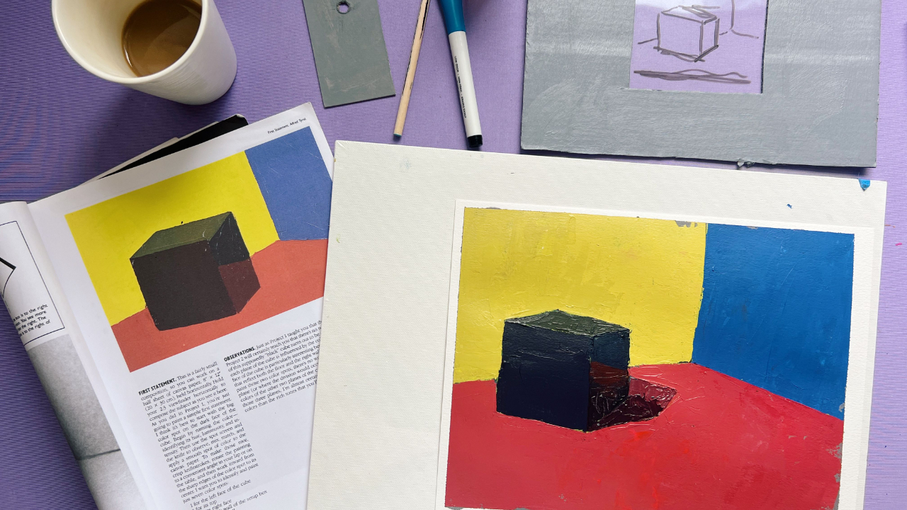
Today’s live demo for Not Sorry Art School students, as we continue working through Arthur Stern’s How to See Color and Paint It, asks a simple question: how black is a black object?
[YouTube video from this demo: This Exercise Taught Me How To See Color]
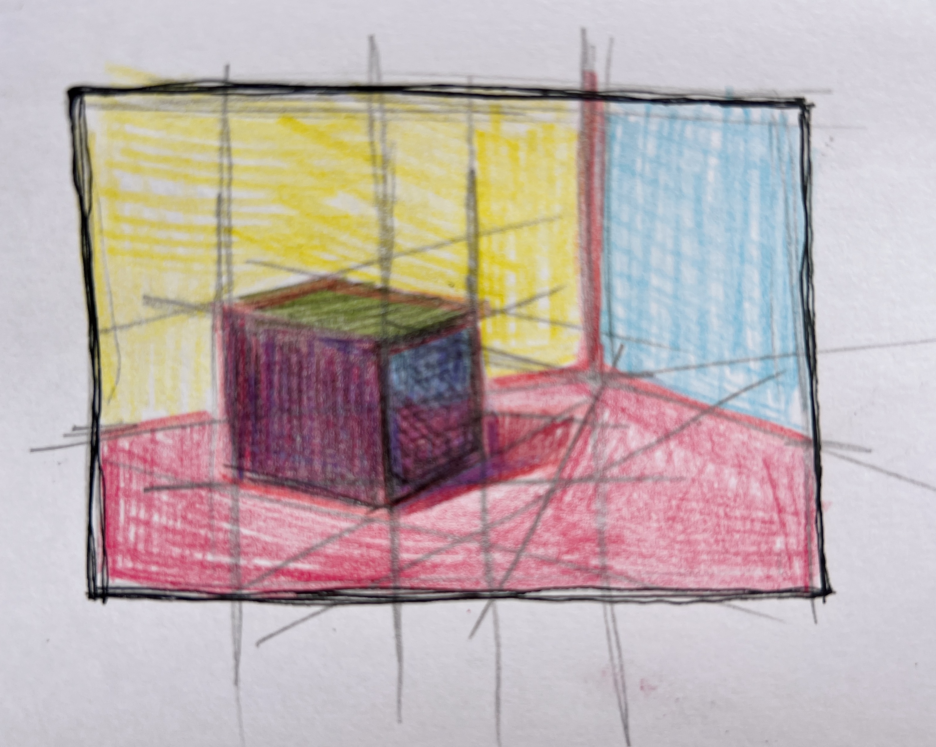
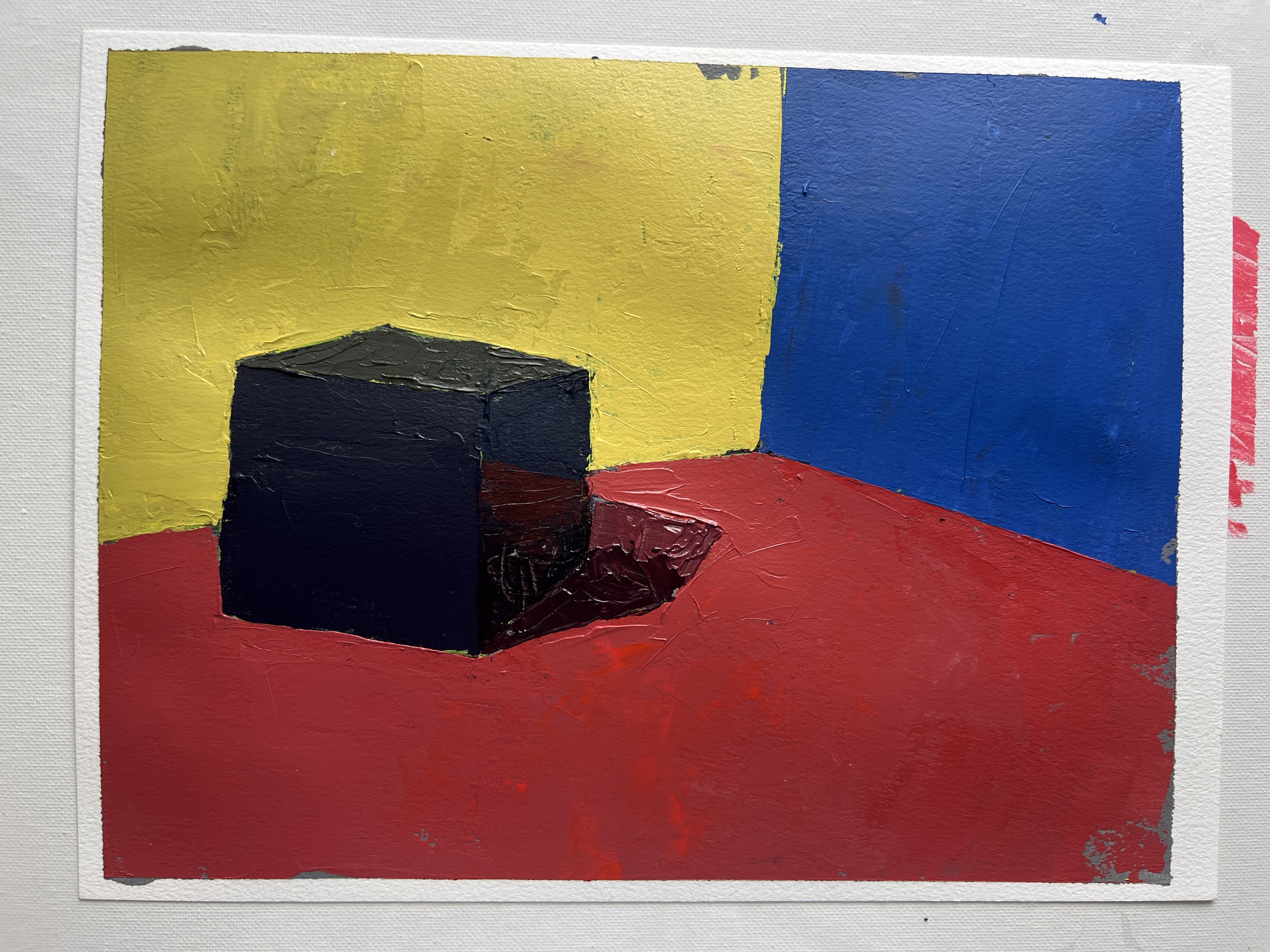
I set up the reference in my studio using a shadow box and an LED light. The exercise called for a black cube, so I painted one of my white cubes with mars black. I know with certainty that this cube is carbon black.
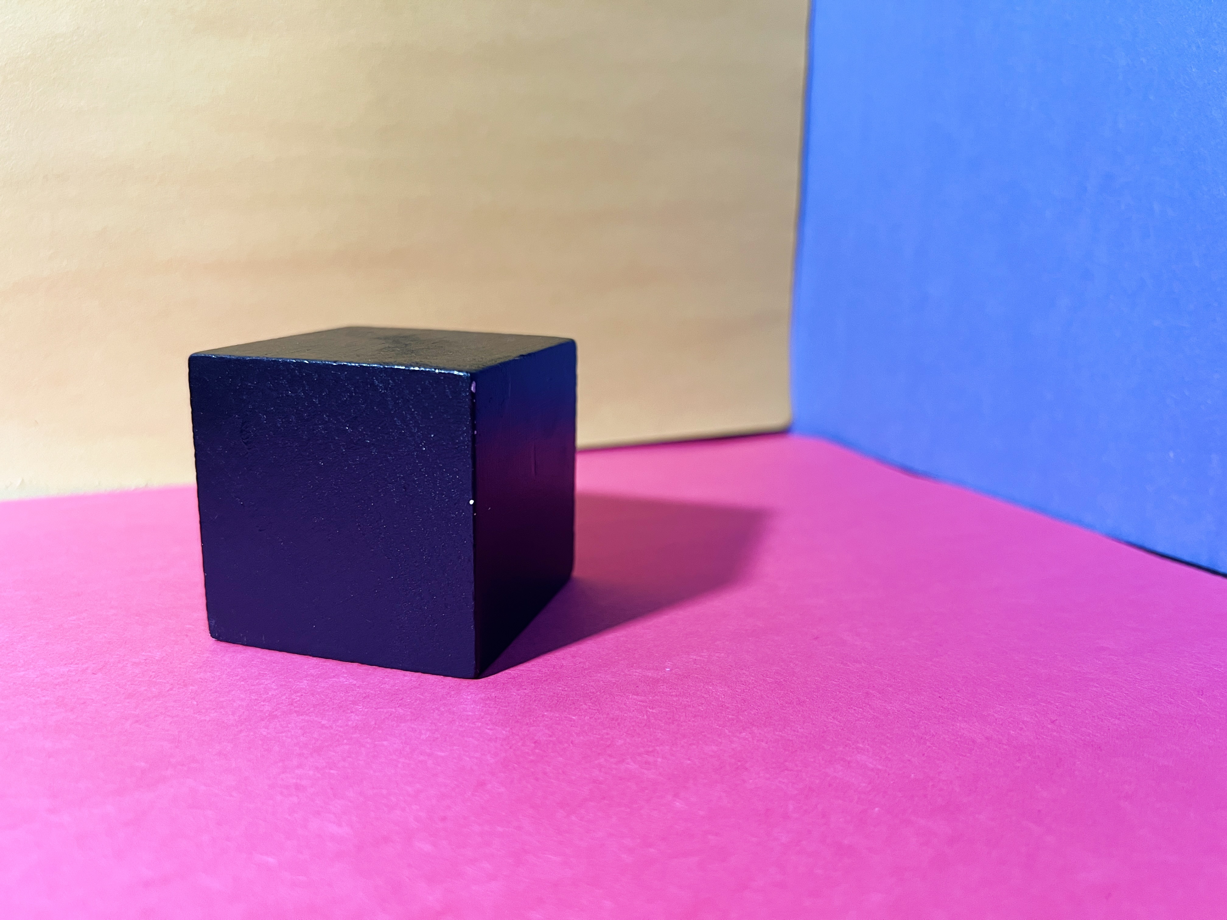
And yet, when placed inside the light box with yellow and blue vertical walls and a red ground, reflected light creates surprisingly vibrant color. The cube is not “black” in any simple sense. It becomes a record of its environment. This is the central principle of the book: you must see color as it actually appears, not as you assume it to be.
Stern begins with white and black to demonstrate how dramatically environmental chroma affects an object. As in project one, we’re also analyzing value, and I provided reference photos to expand on that principle.
In the first chapters, Stern breaks painting into three stages:
-
Statement One: seeing the big color blobs
-
Statement Two: refining those blobs into distinct color and value relationships
-
Statement Three: finishing details
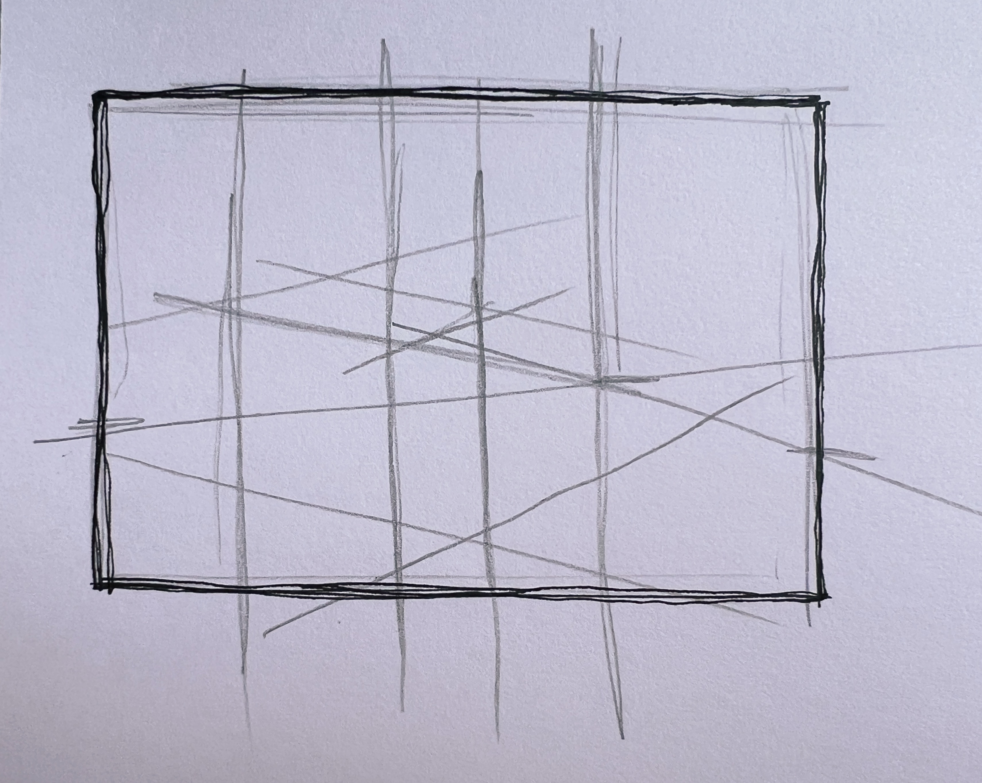
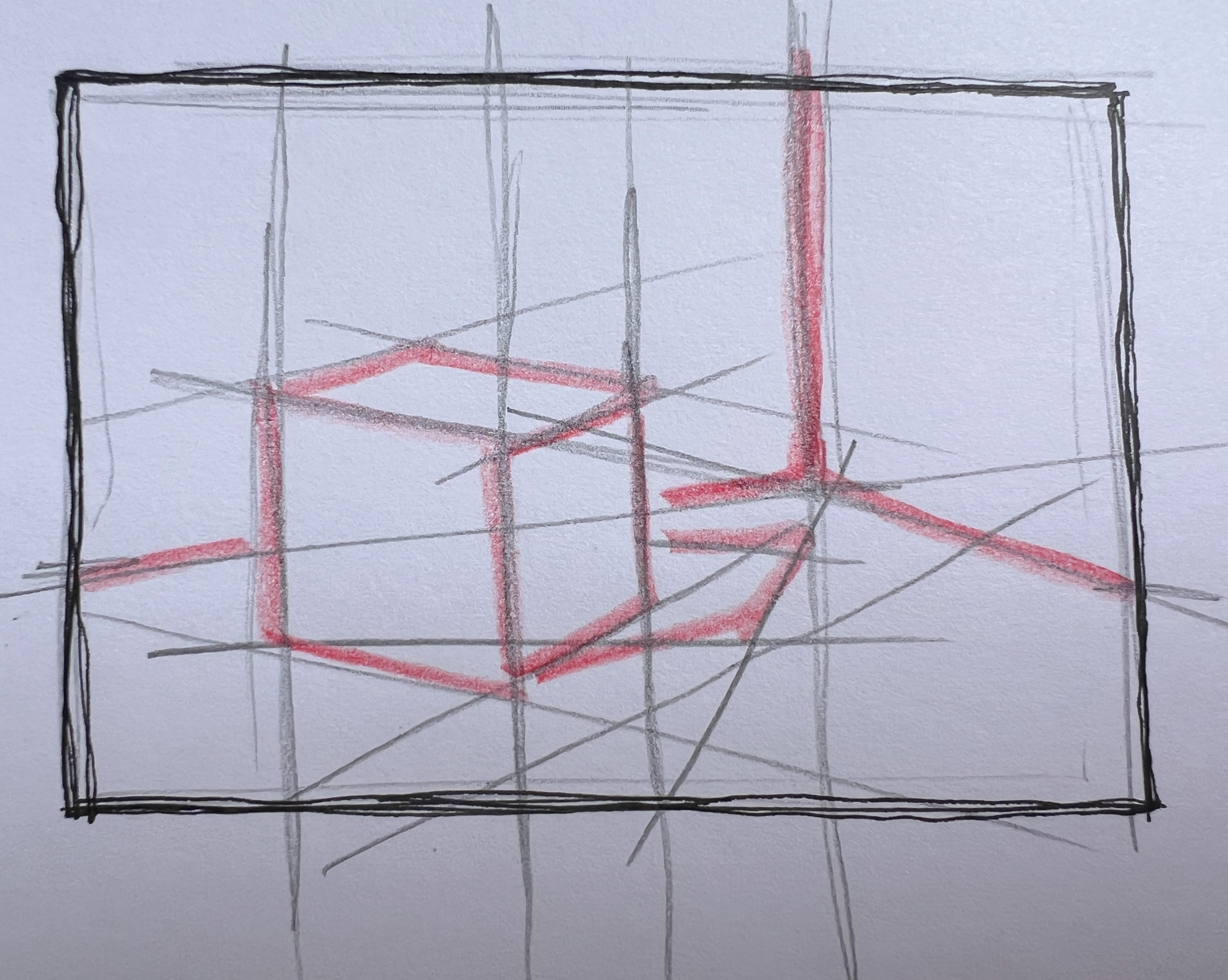
These early projects focus only on statement one. That gives us time to emphasize structure. In both project one and this project, I used intersection lines as scaffolding for the drawing. Rather than relying on contour alone, we use verticals, horizontals, diagonals, and plumb lines to understand how planes relate spatially.
I also stress organizing values in order. Accuracy matters, but hierarchy matters more. I have students begin with a quick value study, marking the darkest value, then the next darkest, and continuing down the scale. Then we jump to the lightest value and work backward until the middle connects. Once the order is established, mixing color becomes far more manageable.
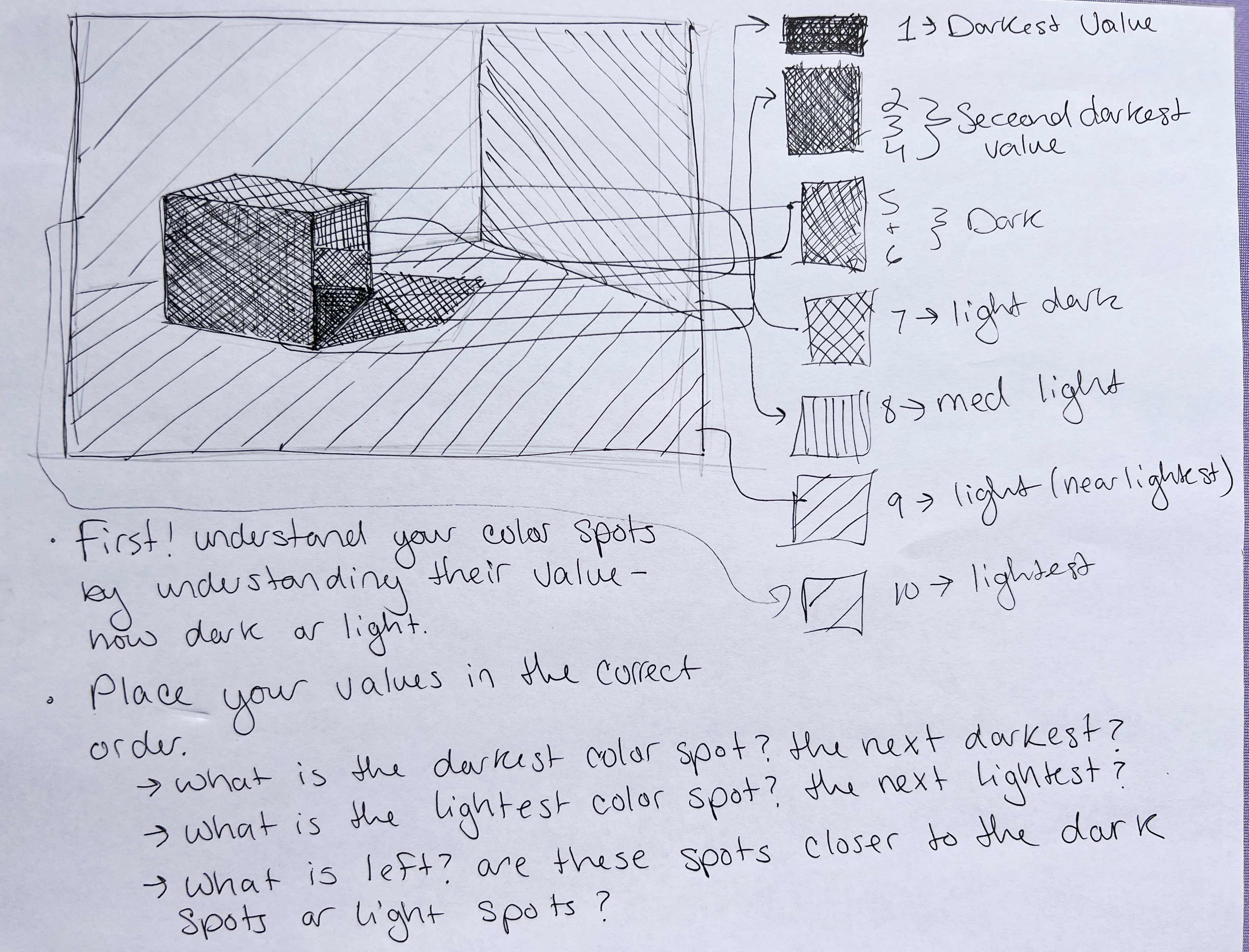
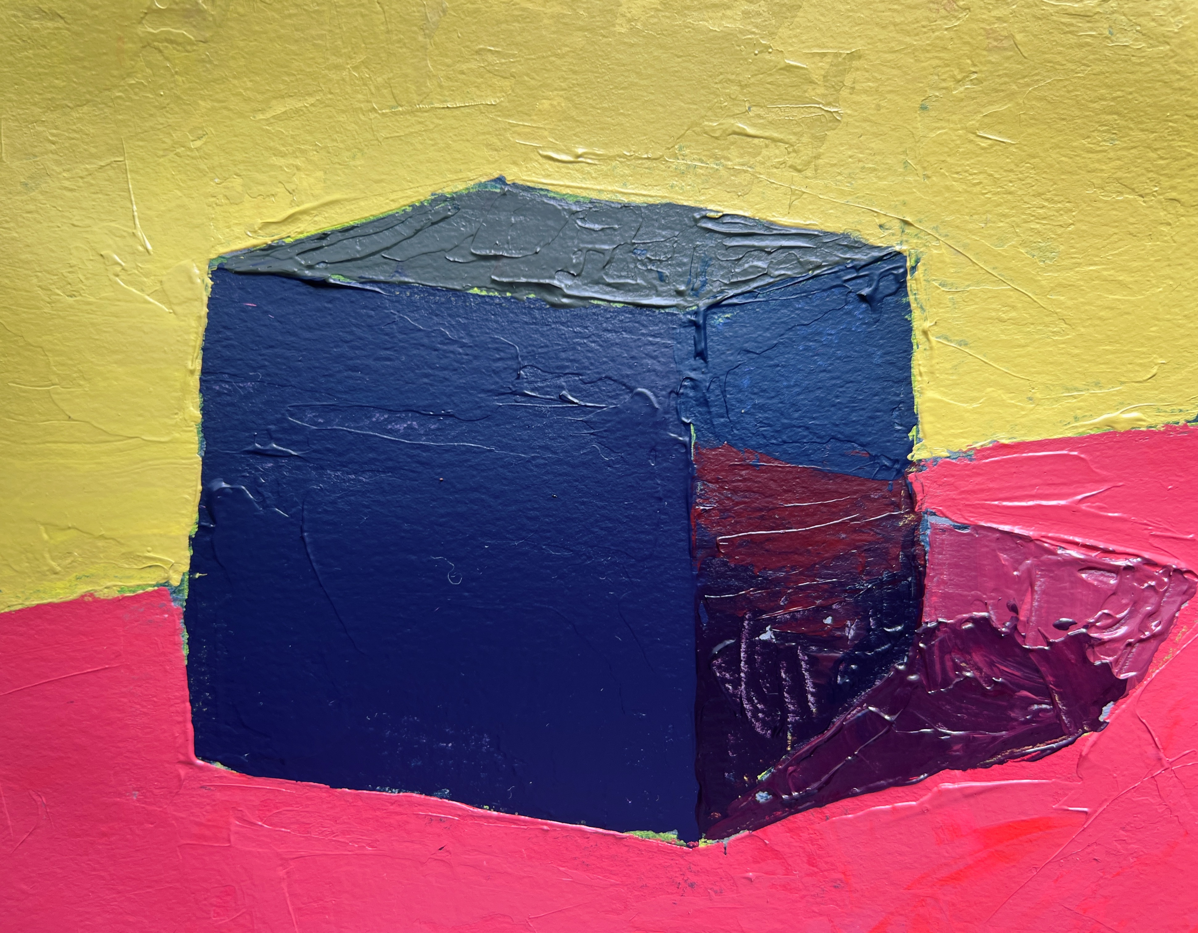
In this setup, we identified ten major value shapes: the yellow wall, the blue wall, the red ground, two distinct cast shadow shapes, and the cube itself. Even within the “black” cube, the shifts are striking. Yellow light reflecting across the top produces a rich green. The front plane reads as a deep violet. The right plane carries dark blues, reds, and maroons. The object holds the world around it.
We ended the live demo by discussing mediums, since palette knife painting always brings up questions about viscosity. Heavy body acrylic works beautifully here, though any opaque, layerable paint will do. The book uses oils, but acrylic painters can increase body and working time with gel medium.
Mediums can feel overwhelming because they address so many variables: dry time, thickness, gloss, surface compatibility. Fabric medium for fabric. Glass medium for non-porous surfaces. If you have a complaint about your paint, there is likely a medium that adjusts it.
I go into more detail at the end of the recorded live demo and included a Liquitex resource page for further reading.
If you enjoy this level of depth, I encourage you to explore the Lifetime Access at Not Sorry Art School, where we continue building these skills in a structured way.
 The confetti from today's Cowtown Marathon in Fort Worth matched the color scheme of today's painting :)
WANT MORE PAINTING EXPERTISE?
Sign up for the Not Sorry Art School newsletter for exclusive offers, course updates, free perks and more!


