Well Begun Is Half Done: Project 1 "How To See Color & Paint It"
Feb 17, 2026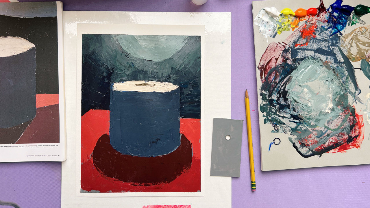
We finally put paint on canvas! I'm so happy that I got to paint a demo in the February 16 live session from Arthur Stern's book How to See Color & Paint It.
Thank you so much for your patience as we spent the last two blogs and live sessions laying the groundwork — materials, vocabulary, philosophy, and approach. That slow start was very intentional.
[YouTube video from this demo: The Color Mistake Beginner Painters Make]
One thing I know about Stern and his book is that he does not over-explain inside the projects themselves. Each chapter gives you a framework, and then you are expected to discover things by doing. It’s a teaching style I actually love, but without support, it can feel confusing or even a little neglectful. So my job here is to bridge that gap for you.
This first painting is all about what Stern calls the first statement. He quotes an old maxim: “Well begun is half done.” The goal is not polish, but clarity. We are mapping proportions, organizing values, and establishing the big shapes before worrying about anything else.
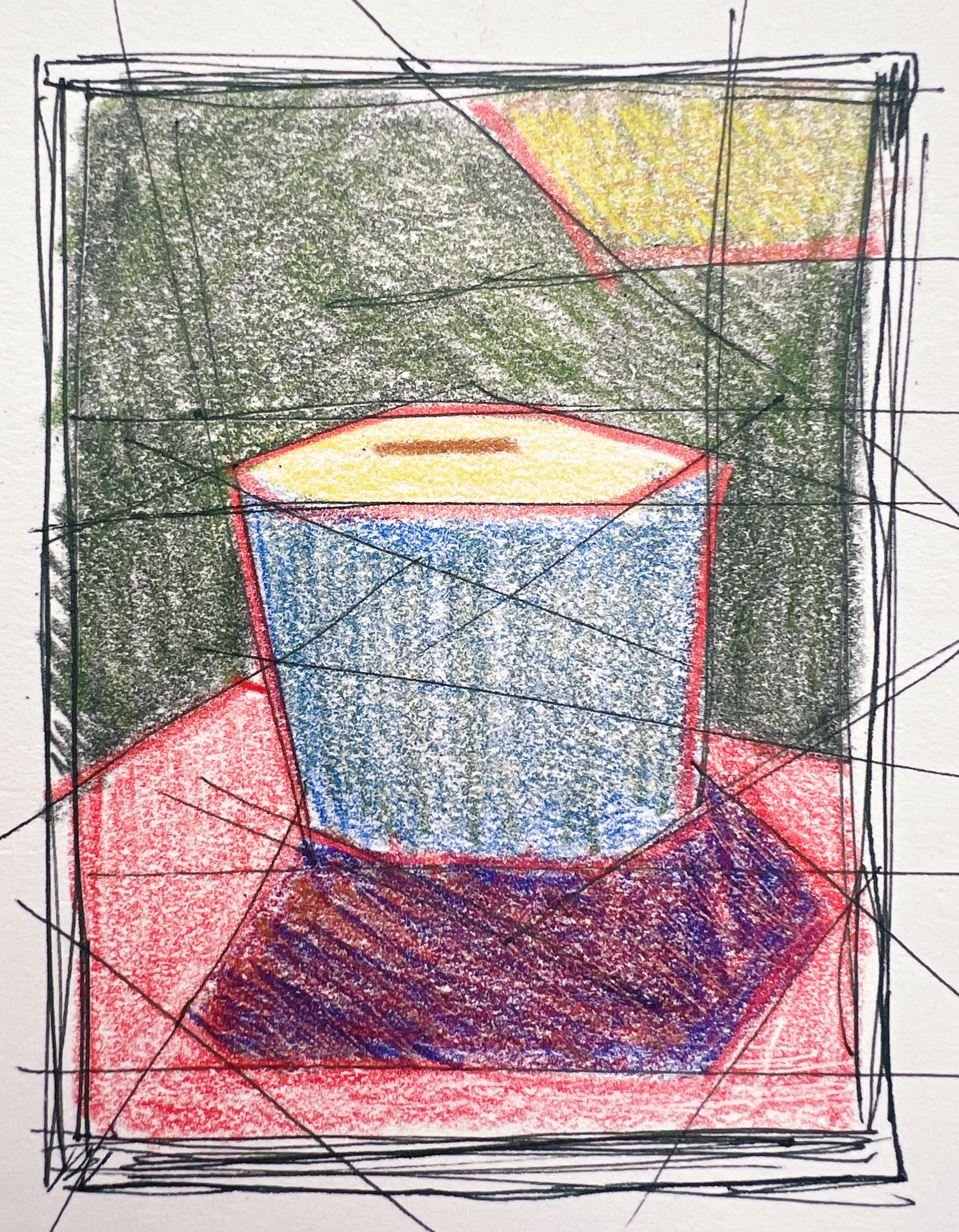
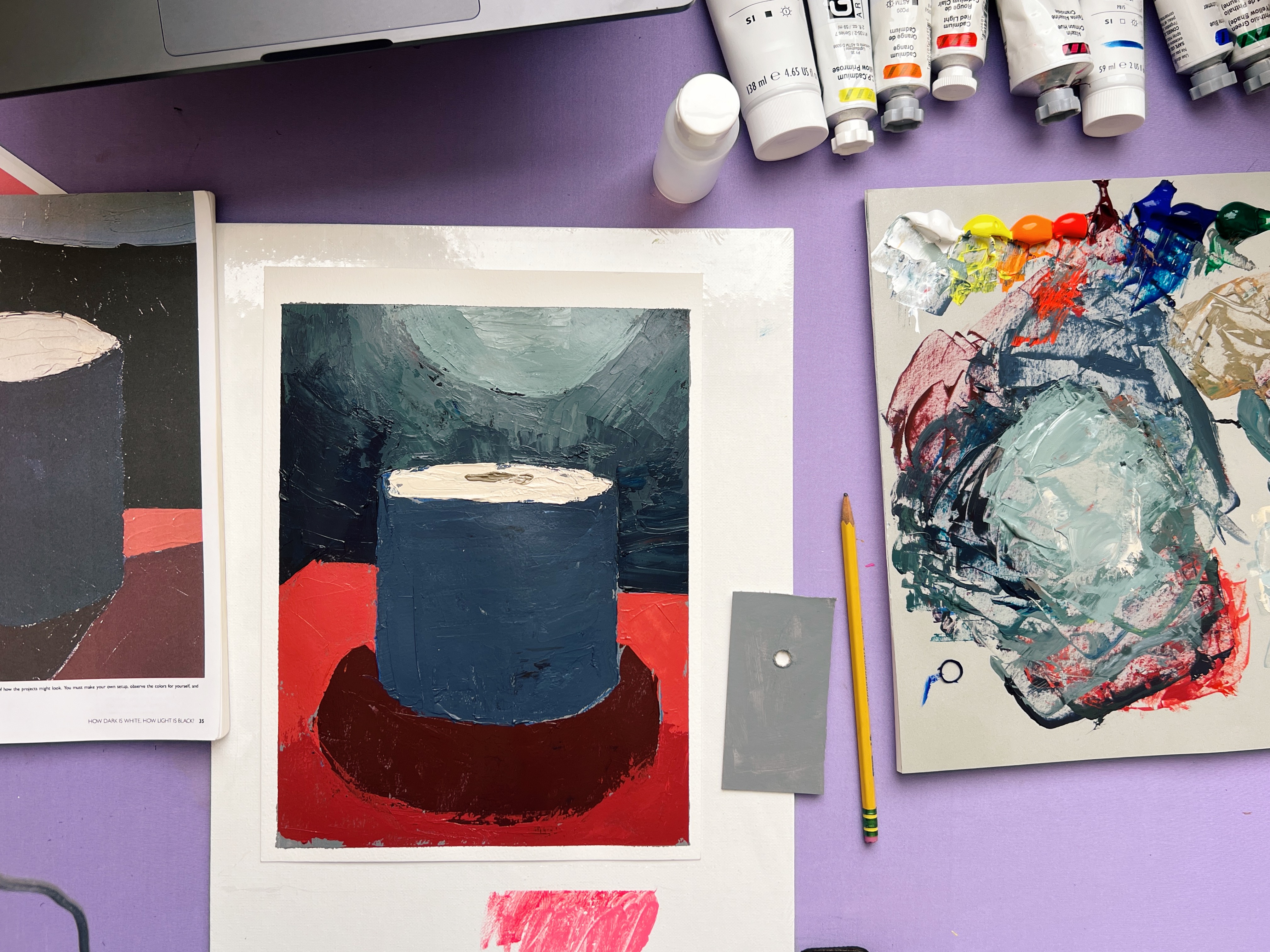
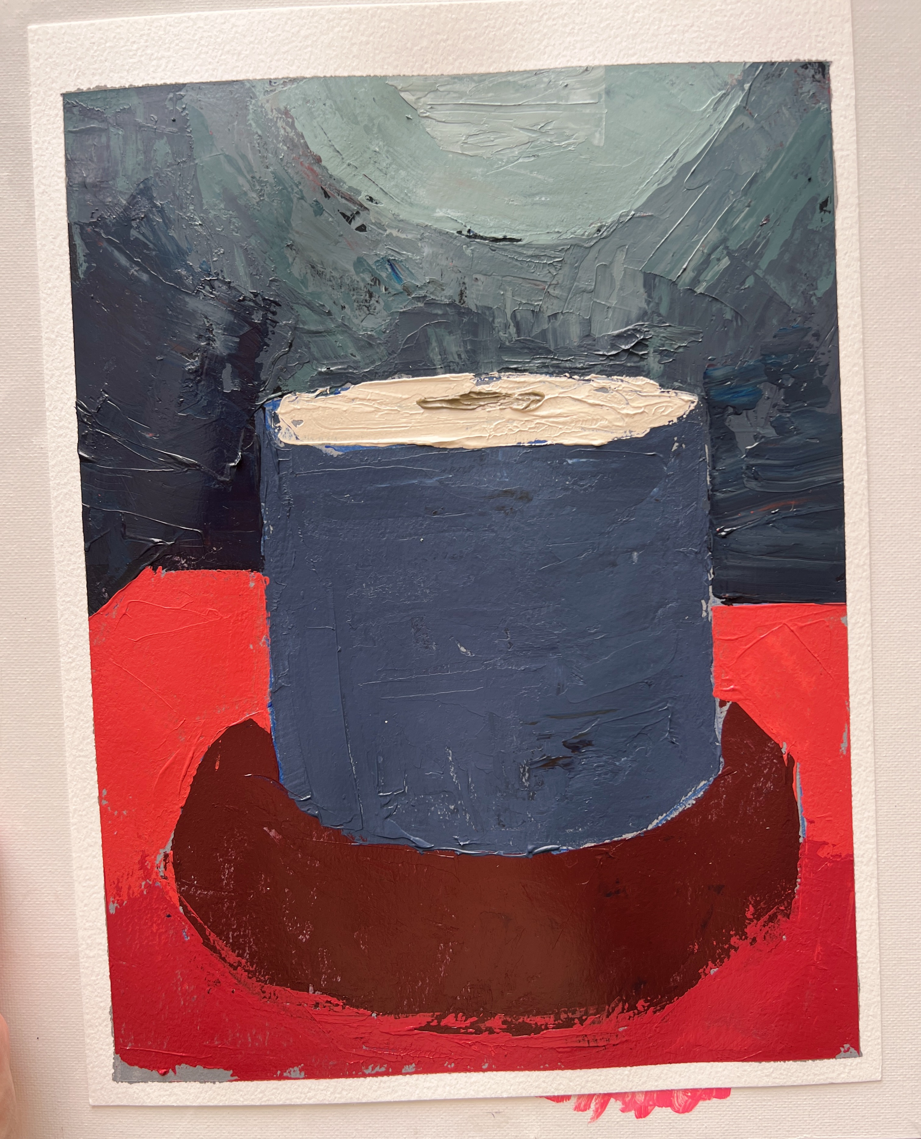 My finished demo
Stern breaks this setup into nine major shapes, and I followed that structure closely. Every student’s reference will be slightly different, because every physical setup is slightly different. Even though Stern’s instructions about placing the light behind the roll of paper are very clear, the exact cast shadow and bounce light will change based on your room, your lamp, and your materials. I spent over an hour adjusting mine the night before the live (with my husband's help), and another hour the day of, and it still wasn’t an exact match — and that’s okay!
That’s why I provided multiple photo references (in Not Sorry Art School community group). The goal is not to copy mine but to understand what matters.
The book does not include images; instead, it instructs you to set up your own still life and paint from life. I first identified the darkest values. You can do this by taking a photo of your reference (or your setup) and reducing the saturation all the way to zero. Avoid using a black-and-white filter, as it can skew the values.
Here, the cast shadow from the toilet paper roll and the unlit portion of the black foam board are the darkest values. I labeled these one, two, and three. Next is the shadow side of the toilet paper roll, which is also very dark—just slightly lighter than the cast shadow and unlit board.
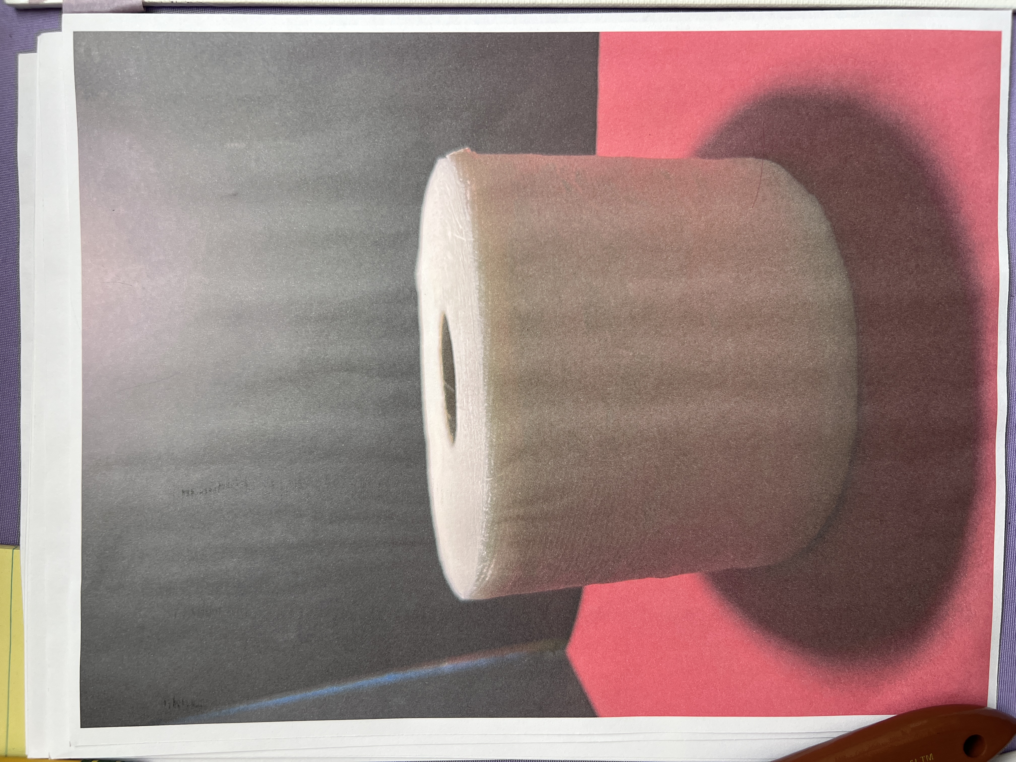 My reference photo, printed
It’s important to notice that although we conceptually understand the toilet paper roll as white, its shadow and bounce light make it appear quite dark. This hints at the idea in Project Three: How Light Is Dark, How Dark Is Light.
Values six, seven, and eight fall on the darker side of the light areas—the darkest lights. These include the lit portion of the foam board and the red construction paper beneath the roll.
Finally, the lightest value is on the top of the toilet paper roll. While not in direct light, it receives abundant bounce light.
You could subdivide these areas further—for example, the top plane of the roll shifts from lighter to darker within that single shape. But the goal here is simplification. We’re forcing ourselves to reduce forms. If this exercise feels difficult, try doing a no–mid-tone value study to strengthen your simplification skills.
Drawing, Proportion, and the Nine Shapes
During the live, I demonstrated how to use plumb lines and proportional measuring to place the big shapes accurately. This is something I teach across many of my courses, and it’s one of the best ways to actually build drawing skill rather than outsourcing it to tools (though tools are perfectly fine if they keep you painting).
While drawing isn’t the primary focus of How to See Color & Paint It, using plumb lines and straight lines helps to build structure for curvilinear forms—like the ellipses on the top of the toilet paper roll and its cast shadow.
By using straight lines to anchor the top and bottom of the forms, you can create more structure and accuracy rather than chasing perfect curves. I think of this as drawing scaffolding.
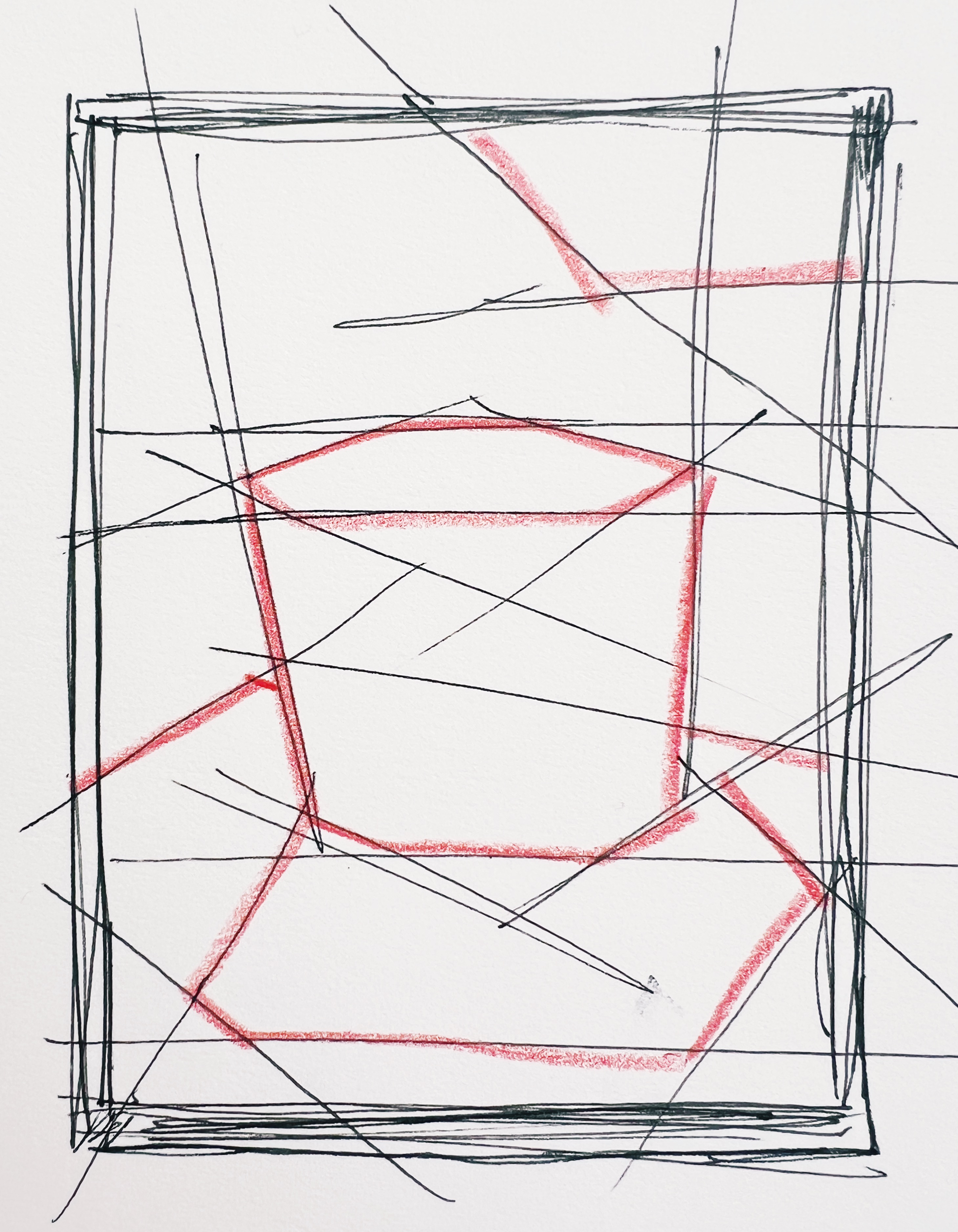 Drawing scaffolding
Contour lines are beautiful and expressive, but drawing for painting serves a different purpose. Here, I kept the forms blocky and used red pencil to show the anchoring lines. From there, I filled in color and value to bring everything together.
 Color and value bring everything together
Because Stern has us working with a palette knife, drawing directly with paint is tricky — not impossible, but difficult. So I lightly sketched in the nine shapes with a graphite pencil before painting. This is not cheating; it’s scaffolding. We are not making a finished drawing — we are locating big relationships.
One thing I emphasized is value order. Highly chromatic colors — especially that red construction paper under the paper roll — trick the eye into thinking they are lighter than they really are. Always double-check your values. Put them in order. That matters more than the exact hue.
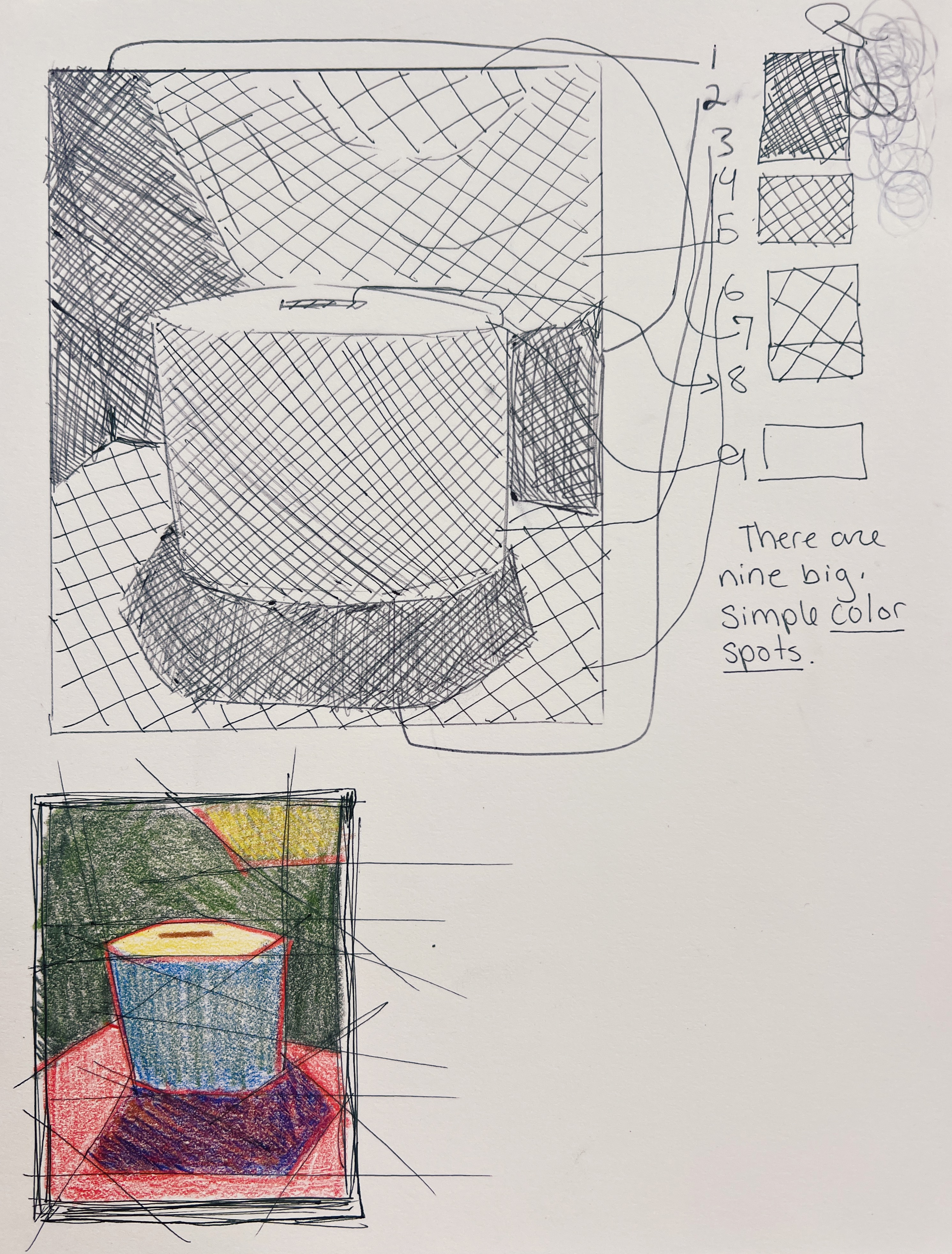 Identifying the nine simple color spots or "shapes"
Toward the end, I made two small choices that technically go beyond Stern’s nine-shape system: I added the center hole of the toilet paper roll, and I let a slight gradient appear in the bounce light on the black foam board. The student example in the book doesn’t include those — but Stern himself encourages exploration. This project should feel light, loose, and experimental.
 The ellipses of the toilet paper roll
 Bounce light on my foam board
A Note on Mediums (A Very Big Topic, Briefly)
Mediums are what make paint customizable. Think of them as the choose-your-own-adventure of painting. A medium is simply the vehicle that carries pigment. Change the vehicle, and you change how the paint behaves: how thick it is, how glossy it looks, how fast it dries, how it handles under a brush or knife. Because artists want wildly different things, mediums can feel confusing — not because they’re complicated, but because they can do almost anything.
Acrylic
Acrylic paint is pigment suspended in a plastic polymer (polyvinyl). It is water-based, fast-drying, and extremely versatile. Heavy-body acrylics are especially well suited for palette knife painting because they hold their shape and texture. However, thick paint is harder to control. When you want more precision, you add a liquid medium to slightly loosen it.
I personally use Liquitex Flow Aid (not the slow-dry version). I mix one part Flow Aid with three parts water and keep it in a small bottle. It thins heavy-body paint just enough to make it smoother without slowing down drying time — which I like, because acrylic’s fast dry is part of what makes it efficient.
Golden Flow Improver works similarly. Any liquid medium that thins paint or adjusts drying is moving you in the right direction. Don’t be afraid if it looks cloudy — acrylic mediums dry clear, which is also why acrylic paint darkens slightly as it dries.
One last note: use more paint than you think you need. Palette knives don’t hold paint the way brushes do, so load them up. Most muddy color comes from not having enough material on the tool.
Oil
Oil mediums are more constrained because oil paint doesn’t “dry” — it oxidizes. That means the structure of the paint film matters.
Straight from the tube, oil paint is thick and toothpaste-like. For palette knife work, you’ll usually want to loosen it slightly.
- Linseed oil makes paint smoother and more flexible.
- Solvent (like mineral spirits) makes paint thinner and leaner — but also more brittle, so it should only be used in early, thin layers (the classic fat-over-lean rule).
I prefer solvent-free options like Gamblin Solvent-Free Gel or oil gels that use resins and waxes. They loosen the paint, increase working time, and keep the surface satin to glossy without fumes. If you have good ventilation, something like Winsor & Newton Liquin or Liquin Gel is another option — it thins paint and speeds drying — but it does contain solvents.
Keep It Light
This first project is about getting comfortable with your knife, your values, and your first statements. It is not about perfection. As Stern’s exercises become more complex, you’ll likely want to thin your paint a bit more for detail work — and now you know how.
Thank you so much for your patience and your curiosity. I hope you’re having as much fun with this project as I am. I’ll see you in two weeks for project two.
WANT MORE PAINTING EXPERTISE?
Sign up for the Not Sorry Art School newsletter for exclusive offers, course updates, free perks and more!


