How "Green" Is Green?: Project Three "How To See Color & Paint It"
Mar 16, 2026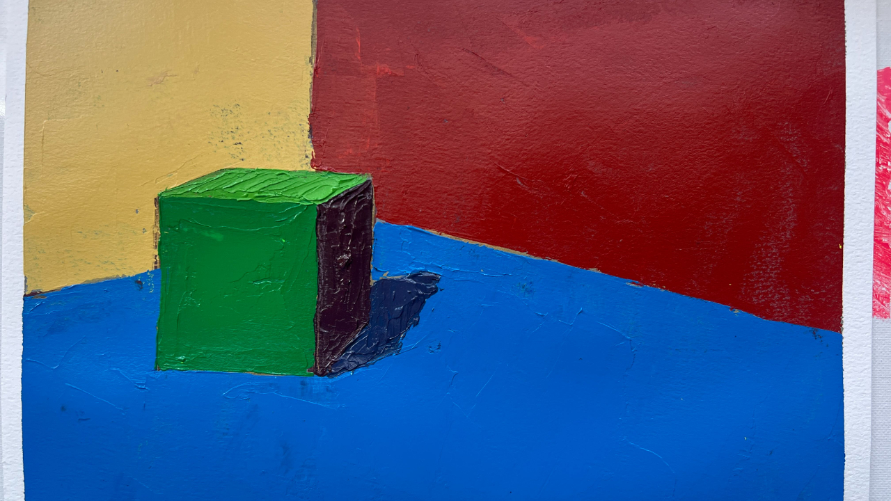
I started Sunday’s live demo of Project 3 from Arthur Stern’s How To See Color & Paint It with a quick glance back at our previous two projects and a look ahead to the next two.
At this point, I’m sure some students are wondering, “Sari, didn’t you say we were going to be doing three statements?” So far, in both projects—including this one—we’re still only making first statements. But don’t worry. Move your tassel from the left to the right—we’re graduating.
We’re about to move from simply making really good first statements into actually using Stern’s three-statement method, also known as working from general to specific. The good news is that our paintings will start to look more complex and painterly as we progress. The sumptuous still lifes and botanicals at the end of the book promise that if we stay patient in these first chapters, we’ll reap the benefits of that patience and attention to big concepts—blocking in light, paying attention to value, and understanding color relationships.
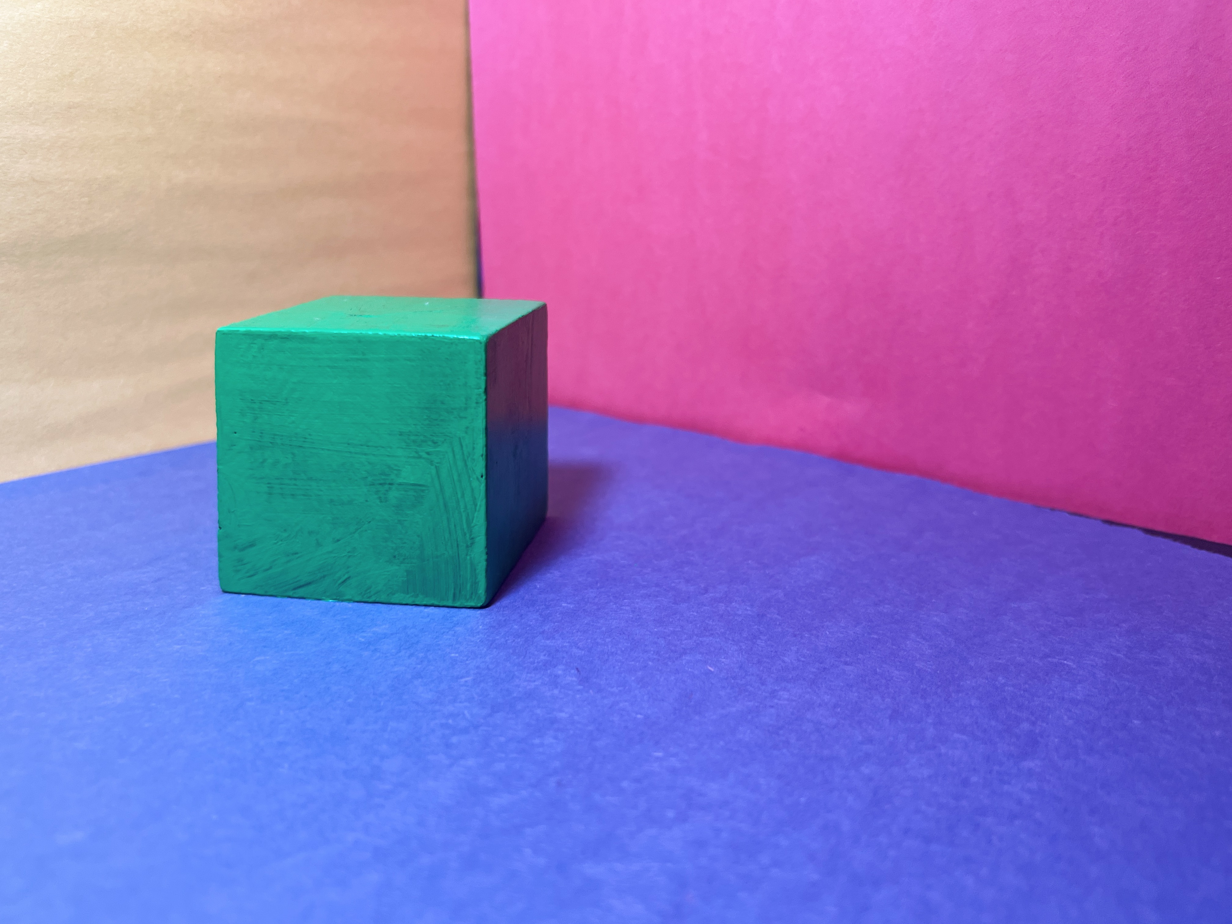
Looking one chapter ahead, you’ll notice that the same three pieces of construction paper I’ve been using in my light box setup—the blue ground with red and yellow sidewalls—will appear again in our next project. Only this time, we won’t be painting a cube, a roll of toilet paper, or an orange. Instead, we’ll simply be painting the planes.
But let’s not get ahead of ourselves. Today’s project asks a simpler question: How green is green?
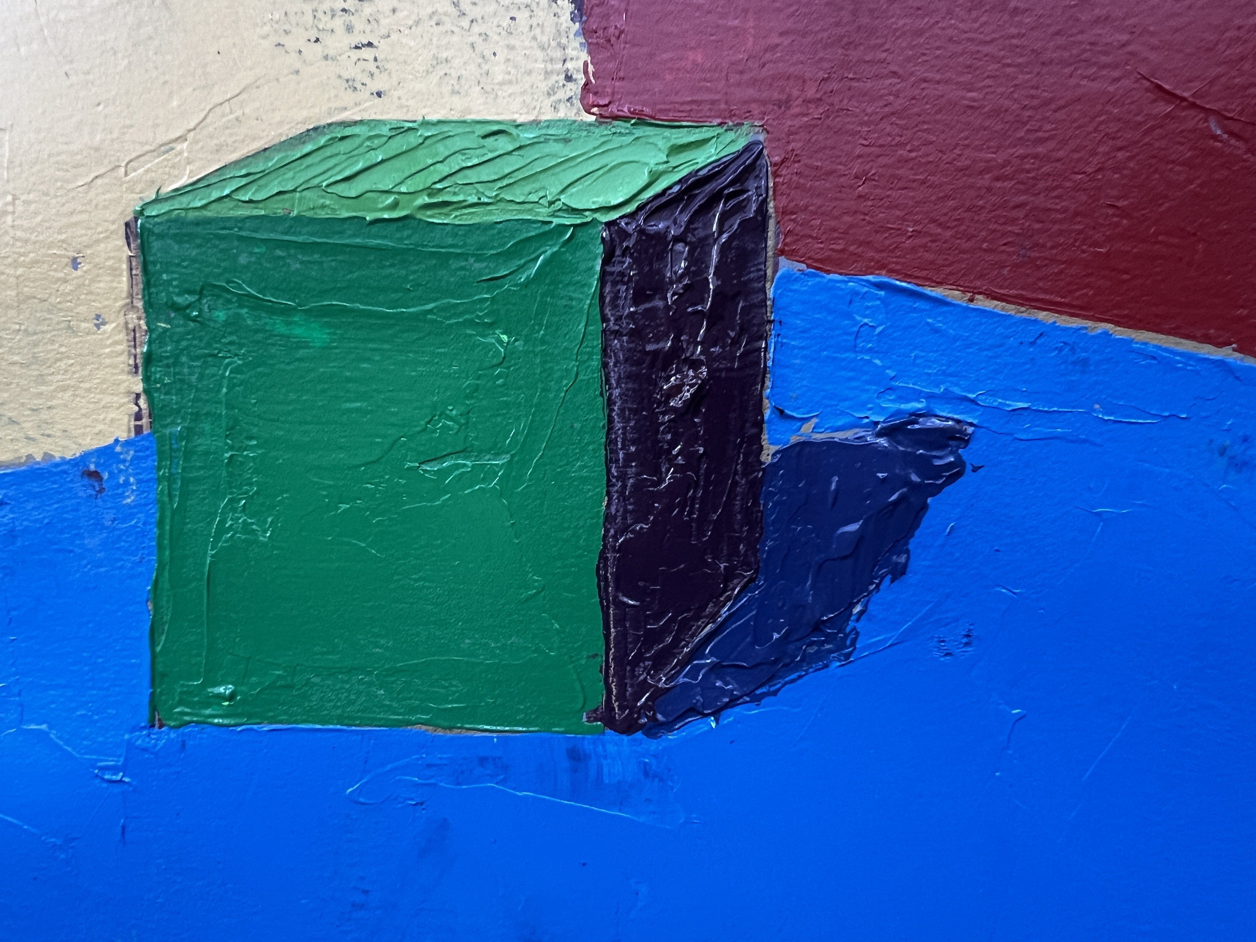
For this exercise, I painted the same cube from last week, but this time in green. I mixed it using the same pigments I’ve been using throughout the book and the color wheel exercises: Phthalo Green (yellow shade) and Cadmium Yellow Light in a fairly even mixture.
I then placed the cube on the three primary construction papers and directed a light toward the yellow wall, so that the yellow bounce light landed on the top plane—and, to a lesser extent, the front plane—of the cube. The results were exactly the kind of visual puzzle Stern wants us to notice.
The top plane became a lighter, slightly yellowish green from the bounce light.
The front plane appeared closer to a “true” green, though slightly muted—because green is almost never as bright as it appears straight from the tube. And then something surprising happened. The shadow side of the cube appeared almost red. This happens for two different reasons, which I explained during the live.
First, because the top and front planes are such vivid greens, even the neutral gray underpainting I started with looked slightly pink by comparison. This is a classic color phenomenon described by Josef Albers in Interaction of Color known as simultaneous contrast.
But there’s a second factor: the red construction paper placed nearest the cube bounced red light back onto the shadow side. Between those two effects—the optical illusion created by color contrast and the physical red bounce light—the plane that is actually more of a browny maroon ends up appearing like the reddest side of the cube.
And this brings us to a point I’m so glad Arthur Stern dedicates an entire chapter to. This is one of the sneakiest aspects of color perception, and it’s something I encounter with students constantly.
They’ll ask: “How can I be mixing red if I’m painting a green cube?” But color is never isolated. It’s always being influenced by bounce light, atmosphere, neighboring colors, optical illusions, and contrast.
Because of that, you have to be willing to isolate what you’re seeing. Use your viewfinder. Look at the color by itself. Remove it from the context that’s tricking your eye. I can tell you from my fifteen years of painting, you do naturally begin to see color more clearly.
But the more important skill—the one you can develop immediately—is the ability to pause and question yourself. When I teach in-person classes, I sometimes describe this as developing an internal piece of software: a pop-up blocker for your assumptions. You look at something and your brain says, “That’s dark green.”
But the pop-up appears and asks: Are you sure? Is it actually dark green? Or is it something else entirely? Learning to question what you think you see—and then actually checking it with a viewfinder—is the key. Honestly, if you walked away from this lesson with only that skill, you’d already be a dramatically better painter.
This is one of those foundational ideas that separates beginners from experienced painters. It’s like missing fractions in third grade—if you don’t really understand it early on, it makes everything else harder down the line. I don’t mean to sound overly serious on what is otherwise a pretty simple concept. But it really is that important.
The good news is that we’ll keep revisiting this concept throughout the course, so there’s plenty of time for it to click. For now, just remember this: Even if the object you’re painting is objectively green on all sides, each plane of that object must be investigated individually. You may discover that a surface isn’t green at all. It might not even be dark green.
Sometimes it’s closer to a neutral, or even the complementary color of the object itself, because of the colors surrounding it. So always check your colors—no matter how confident you are that you know what they are.
If you’re a member of Not Sorry Art School, make sure to watch the live demo recording where I demonstrate this in real time.
And if you’d like to become a member and participate in the live sessions, I recommend signing up for Lifetime Access at Not Sorry Art School, which gives you access, for life, to every course in my curriculum as well as to our thriving community group.
I look forward to our next meetup in two weeks (March 29), where we’ll tackle the deceptively simple challenge of painting planes.
WANT MORE PAINTING EXPERTISE?
Sign up for the Not Sorry Art School newsletter for exclusive offers, course updates, free perks and more!


